
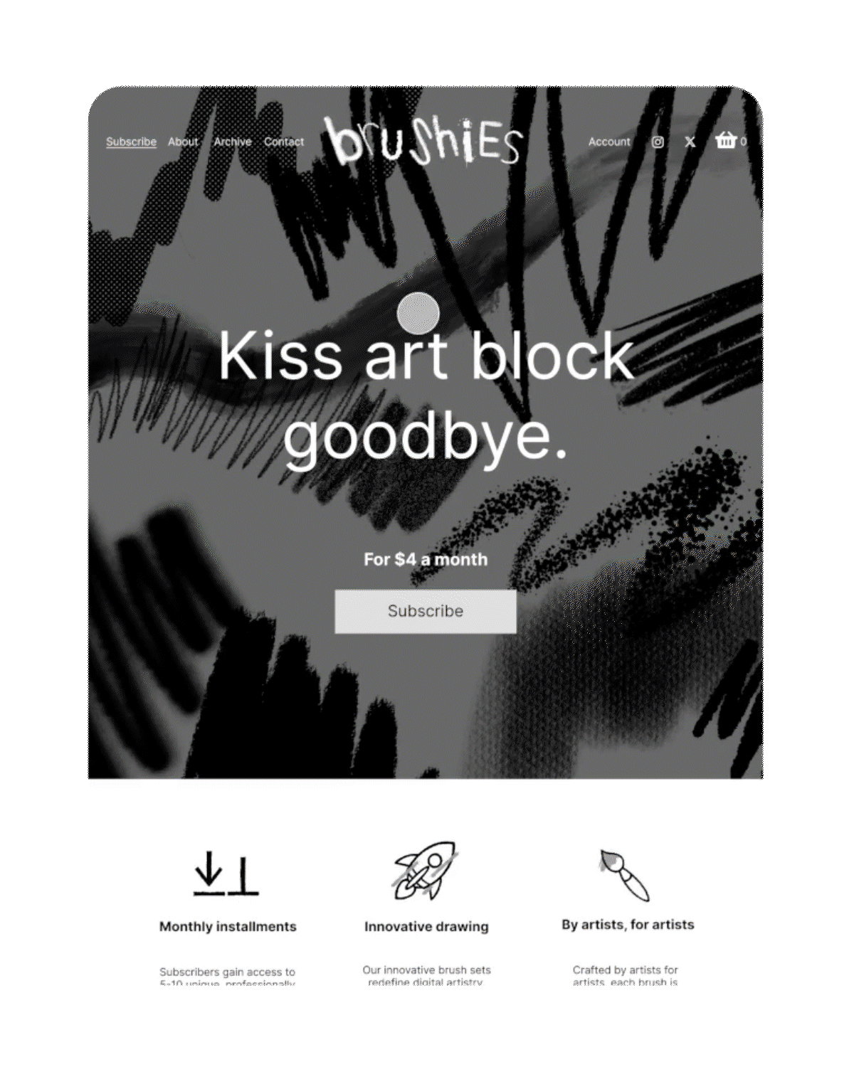
Kiss art block goodbye.
About Brushies
Designed for digital artists, Brushies delivers monthly digital brush sets, textures, and instructional guides (compatible with certain digital drawing softwares) to promote creative experimentation and mitigate art block. The platform also fosters an online community, promoting collaboration and exposure opportunities for subscribers.
My role
UI Designer,
UX Designer
Tools
Figma,
Flash, HTML
CSS
Timeline
2 months
1. Overview
Problem
Since its November 2024 launch, Brushies has experienced below-target-level conversion rates and elevated bounce rates.
According to research (see more detail in Section 2), digital artists have difficulty finding clear information about the platform and its services, as well as a streamlined path to subscription. Together, these friction points have led to a bounce rate exceeding 50% (<35% desired) and a conversion rate of just 3% (>5% desired).
Solution
To enhance user navigation, I redesigned the landing and interior pages to centralize product information and clear, accessible calls-to-action.
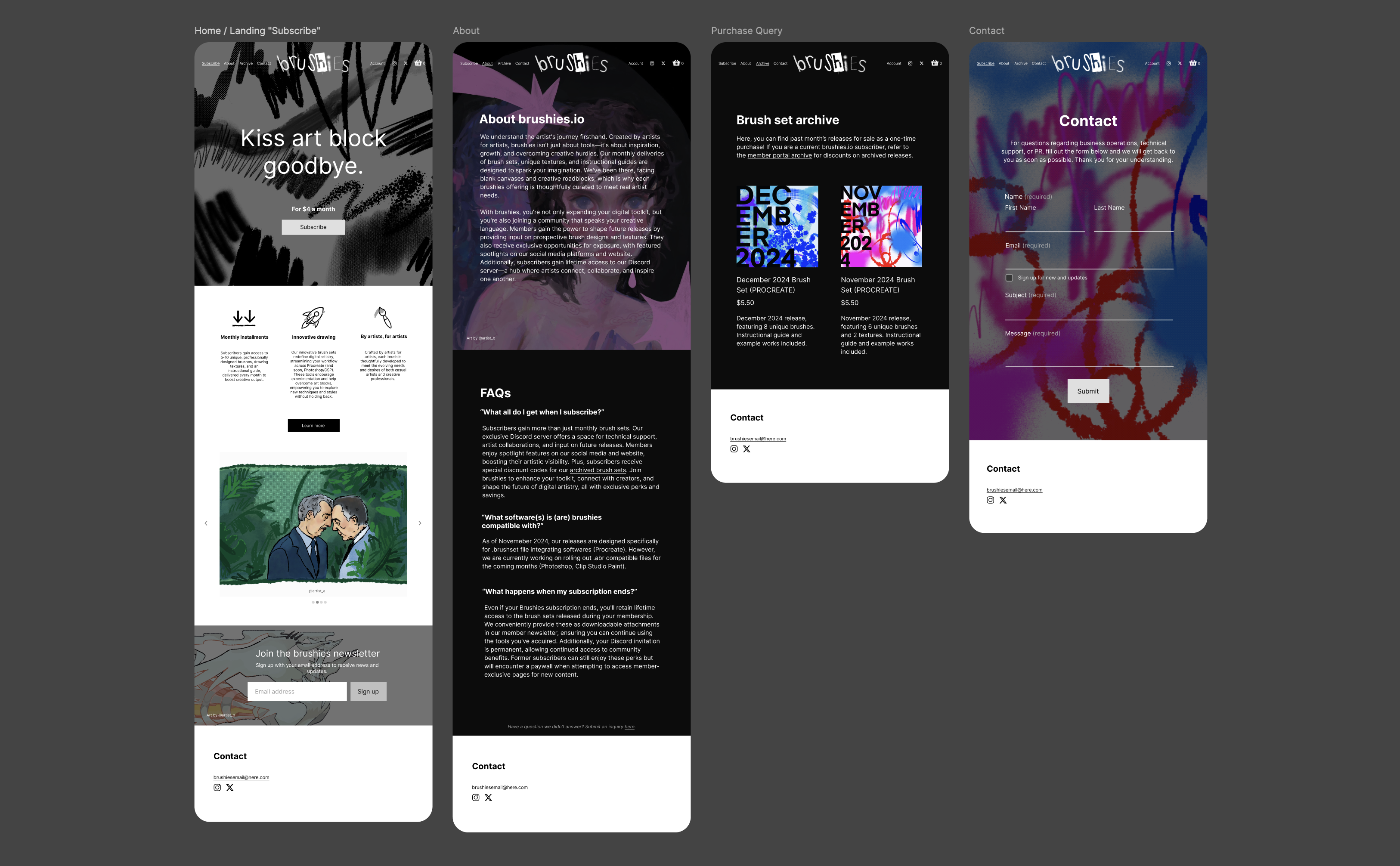
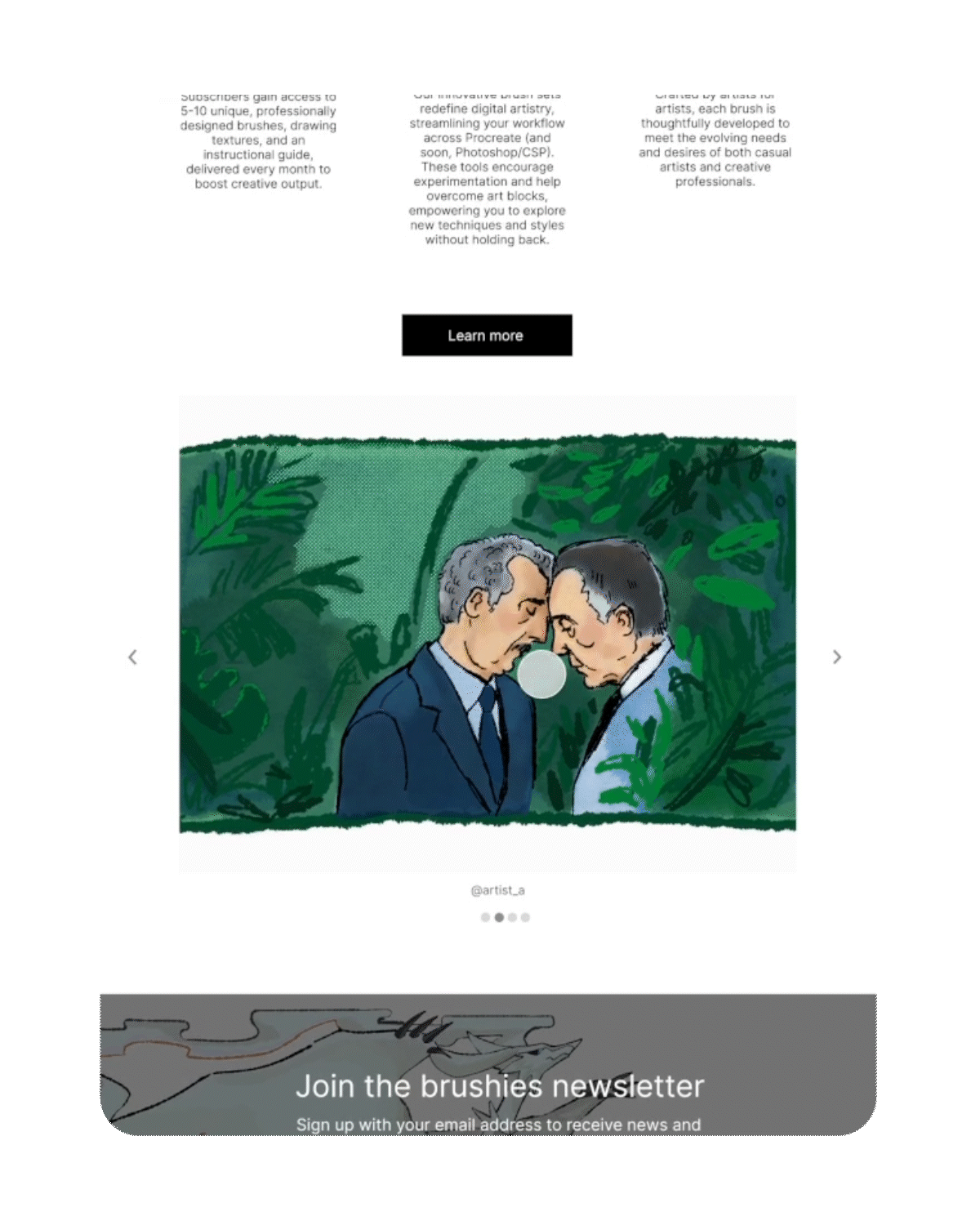
Brushies’ new landing page serves as a centralized hub, guiding users to: A) explore its services and FAQs, B) view examples of work created using its services, and C) seamlessly begin the subscription process. Additionally, the new site features a dedicated user portal, providing subscribers with consilidated access to their personalized tools and benefits.
Intuitive
Information is located where users naturally expect to find it
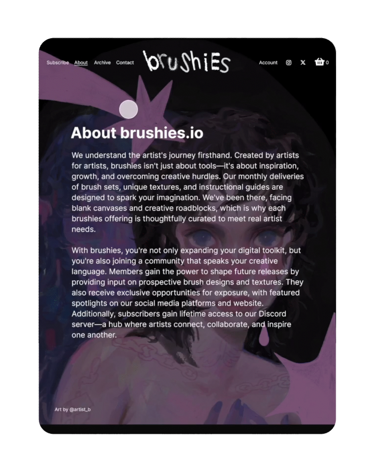
Brushies’ updated pages now include captions, buttons, and graphics in areas where UX research revealed gaps. Information is easy to find, and navigation flows naturally with minimal effort.
Frictionless
Strategic linking across all pages for a seamless user flow
With prominent calls-to-action linking landing and interior pages, users can move through the site more fluidly than ever before. By eliminating site frictions, we can project an improvement to the conversation and bounce rate, all while enhancing the overall user experience.
Organized
Your personal hub—everything you need, all in one place
No more digging through email newsletters for embedded downloads—subscribers can now log in to the Brushies website's built-in portal for easy access to their monthly downloads and curated content.
2. Research
User Research
Identifying current pain points and improvement opportunities
In order to promote overall navigation and boost conversion rates, I needed a deeper understanding of the Brushies user base, considering key behaviors for both mobile and desktop visitors.
To achieve this, I conducted interviews with a diverse, representative group of digital artists. To better organize and analyze my findings, I synthesized the data into an affinity diagram using FigJam. Categorizing data this way helped me identify user patterns and pinpoint areas of the site that had significant room for improvement.
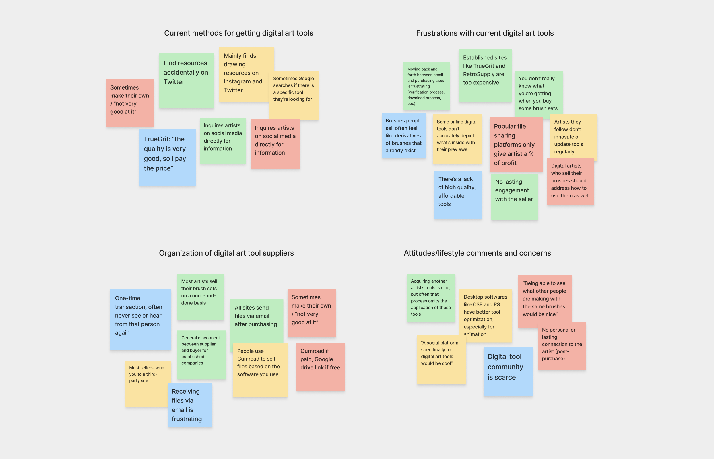
Based on conversations with target users, I learned the following:
*
People need supporting graphics to visualize ideas.
For a visually driven audience like digital artists, images and illustrations help clarify and reinforce the content they’re reading.
*
Artists are looking for more than just a one-and-done transaction.
Beyond tools, digital artists are seeking connection, community, and continued engagement with the seller.
*
Most people like having everything they need all in one place.
People who use digital subscription services like being able to access their downloads directly from the site, versus receiving their files via email.
Empathizing to Iterate
Visualizing personas and journey maps to achieve user goals
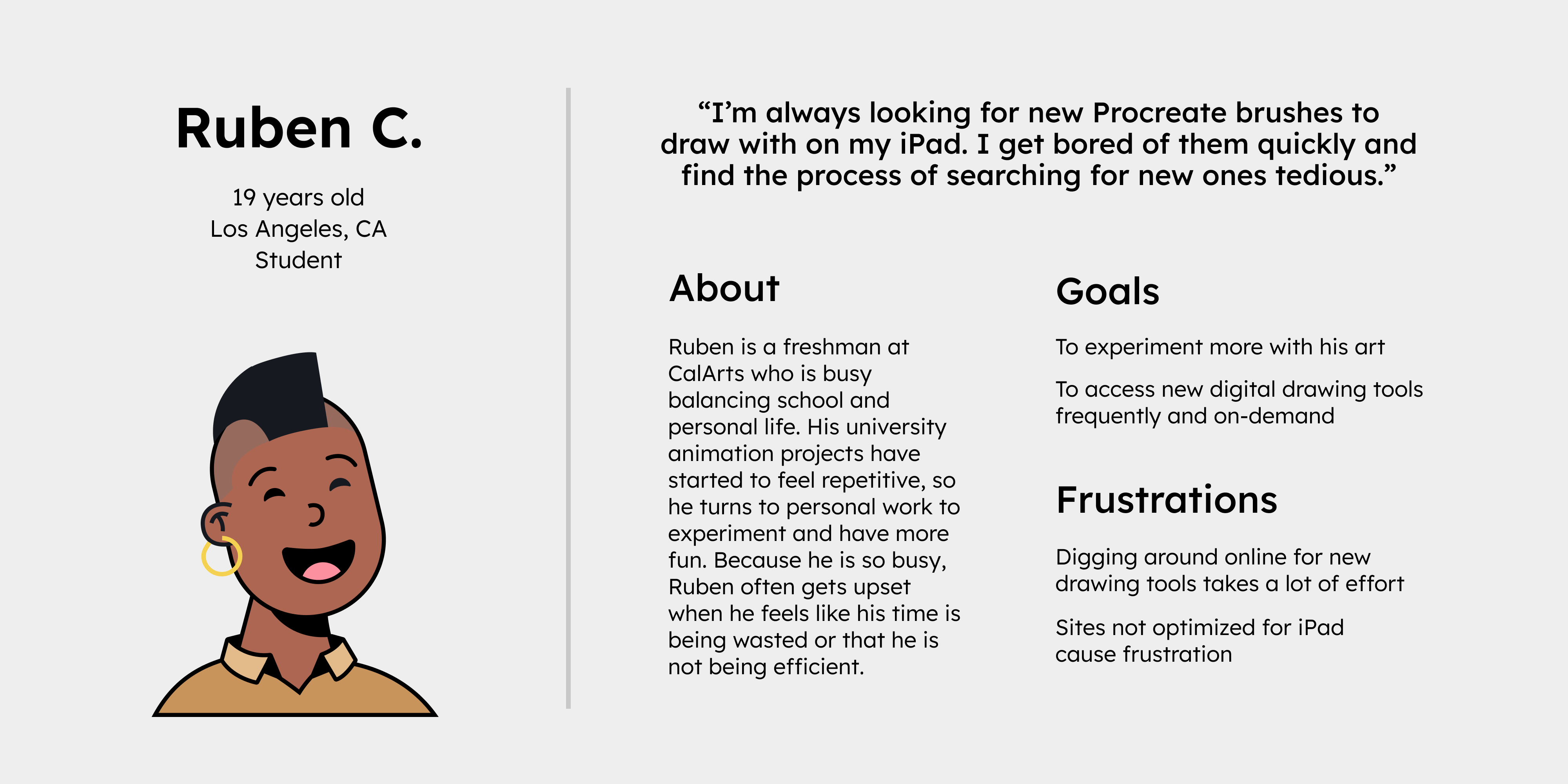
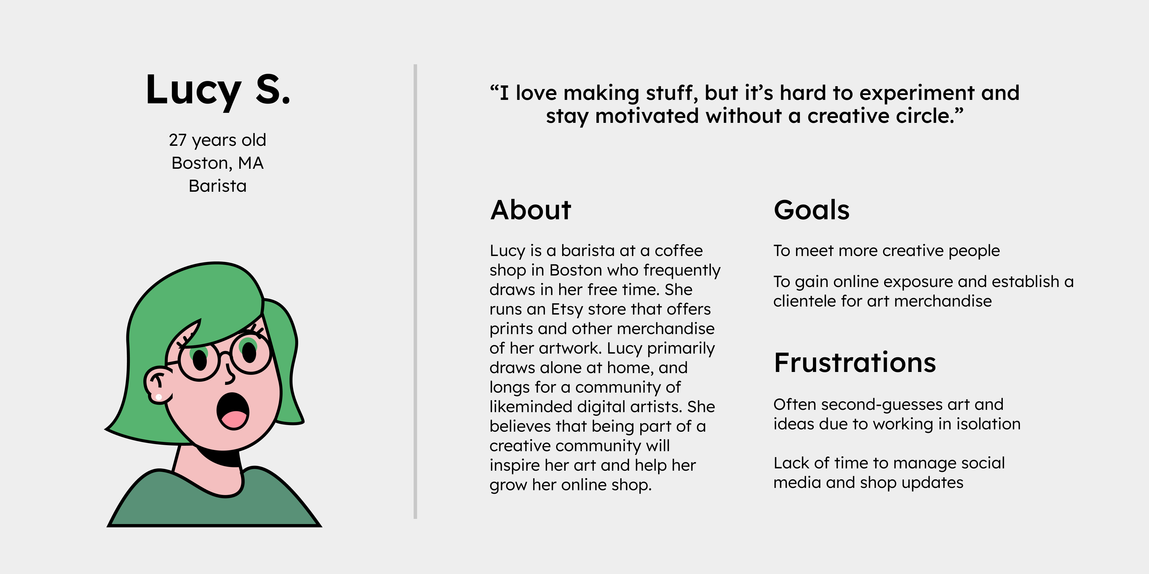
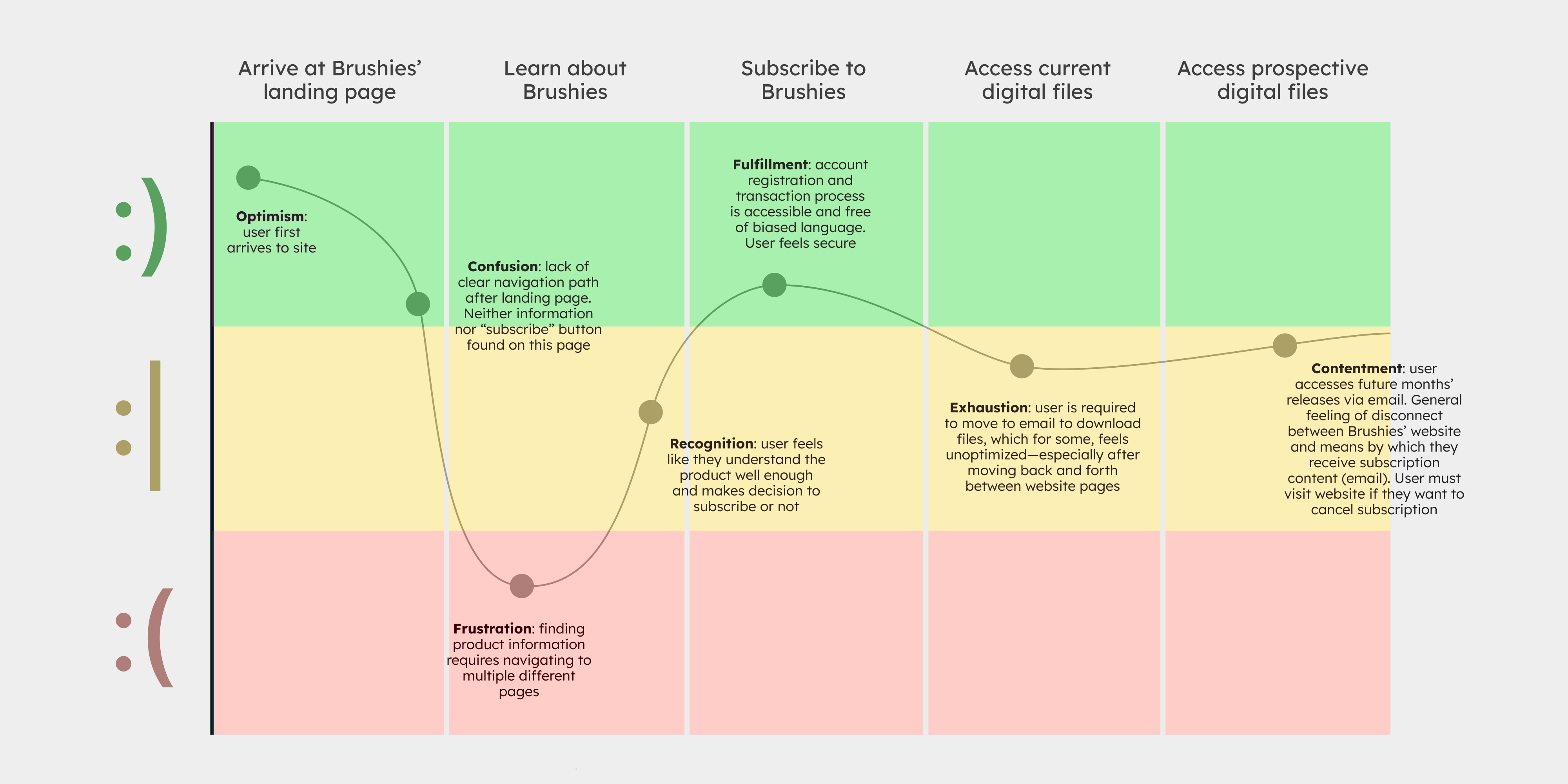
After reviewing my personas—user's goals, behaviors, and pain points—I initiated user testing on the site’s existing structure to identify Brushies-specific usage issues and areas for improvement.
Based on site analytics and persona profiles, I derived the following journey map to visualize how users might move through the site (before observing to them directly).
Usability Study
Conducting a moderated usability study to see how users behave and navigate in real time
In this study, I walked participants through a set of navigation tasks, closely observing user flow and site responsiveness.
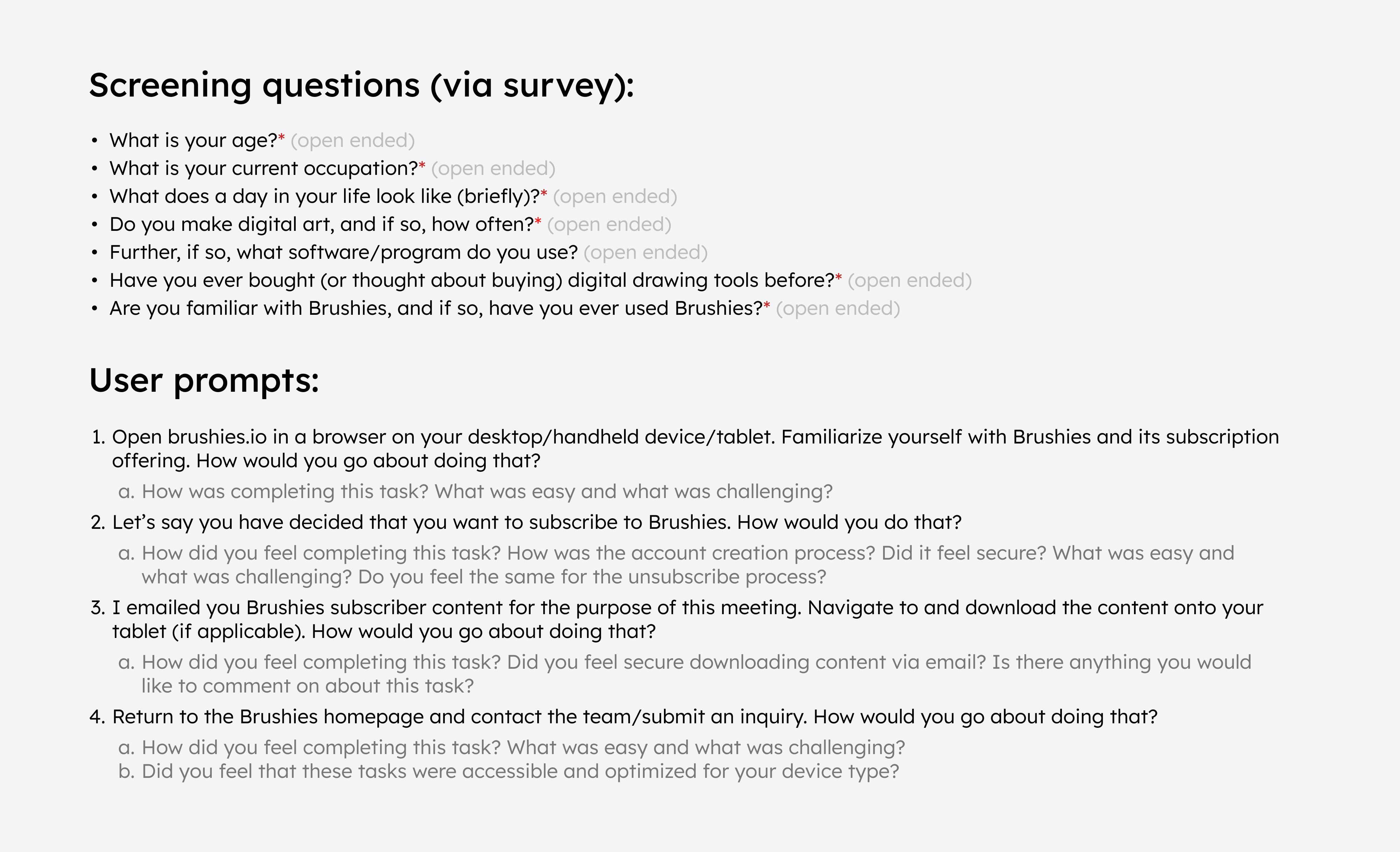
Observed users accessed the site from a variety of different devices, including smartphones and tablets. Additionally, each participant was pulled from a representative sample of prospective digital artist subscribers (see screening questions in image above). After observing their navigation on the current Brushies site, I arrived at the following 5 key takeaways to guide my next iteration of design:
1. The site is unoptimized, specifically for tablets (or devices they intend to use the service on)
2. The landing page layout inhibits users more than it helps them
3. The current means by which a user navigates pages breaks the experience altogether
4. Product information is spread across pages and needs to be consolidated
5. Users want to be able to subscribe and download files without leaving the website
3. Design
Ideation
Research-informed design explorations
After conducting my initial usability study and sharing conversations with prospective subscribers, I began mapping out new versions of the website, focusing on page structure and visual hierarchy. Before heading over to Figma to begin mockups, I organized my design priorities in FigJam to help guide all future iterations of the platform.
Referring back to my usability study takeaways during this phase helped ensure my designs stayed, first, free from personal bias, and second, centered on user needs and accessibility.
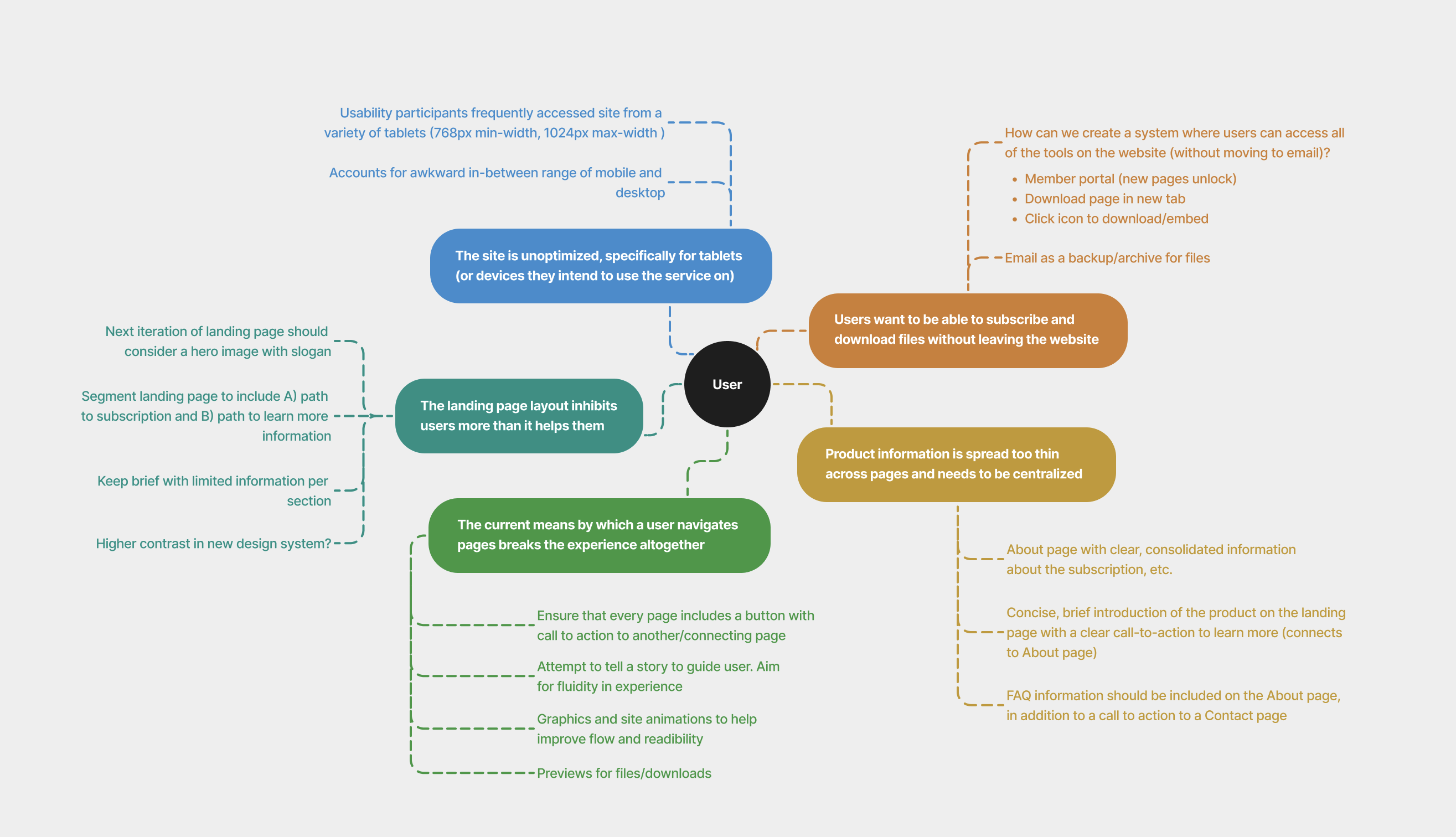
As I moved into the wireframing and mockup phases, I ensured my designs explored some of the key features outlined in the figure above: a built-in subscriber portal, segmented pages with more calls-to-action, and improved responsiveness for tablet devices.
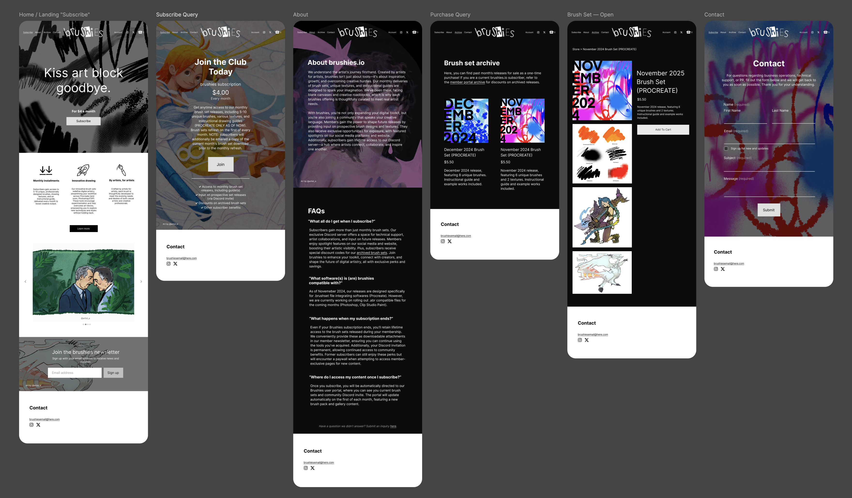
Wireframes and Mockups
Adjusting page structure for improved usability
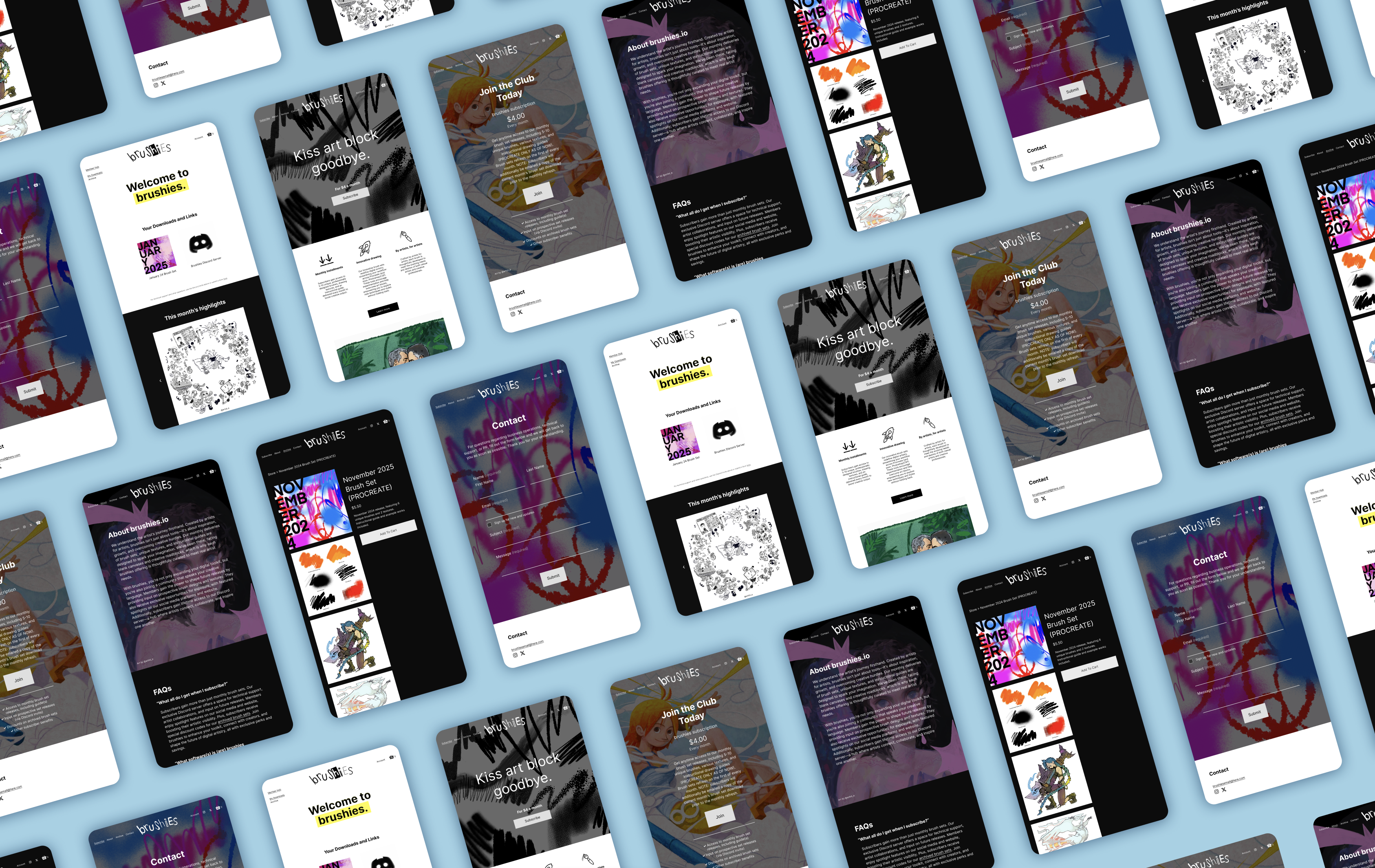
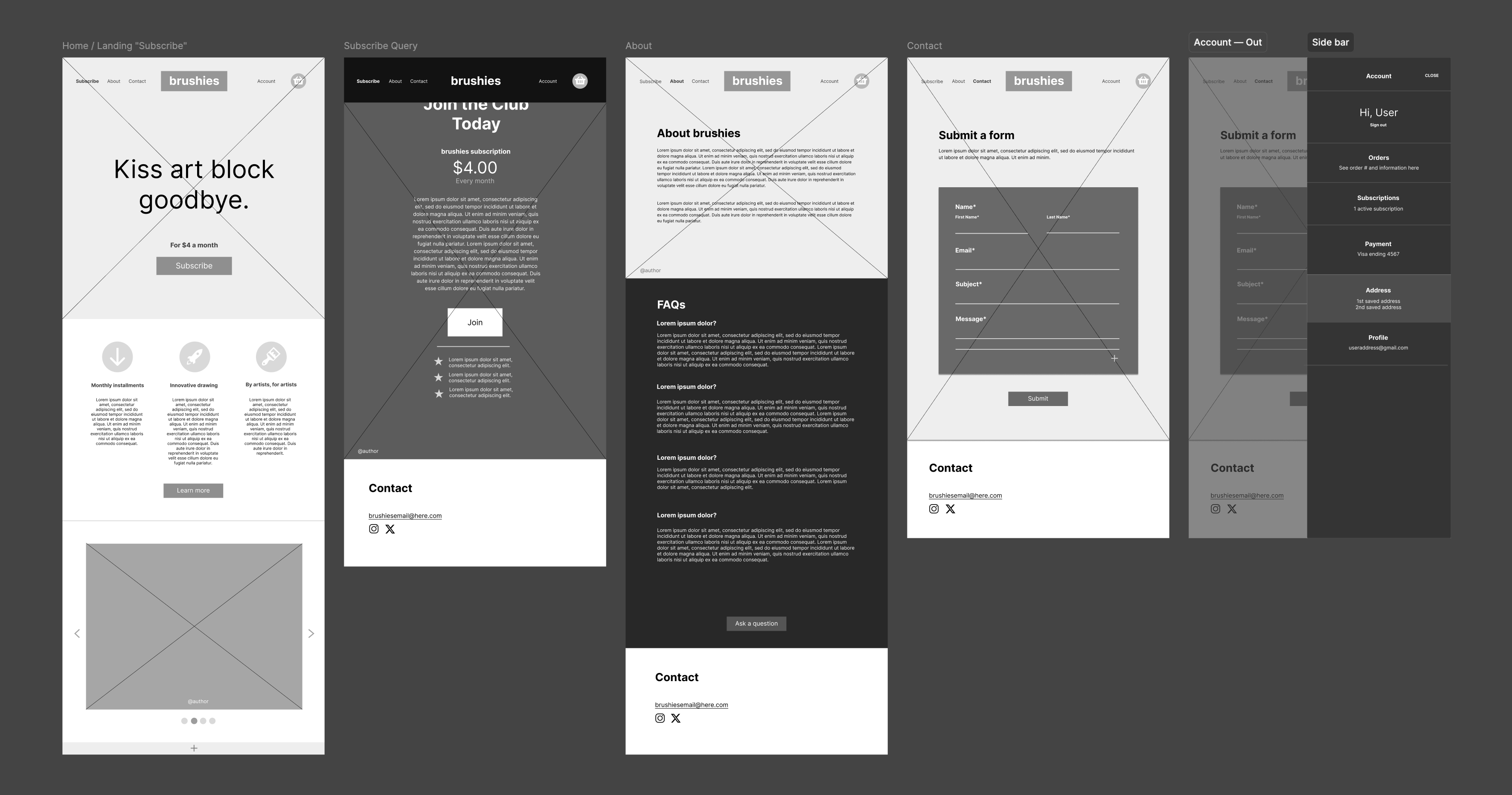
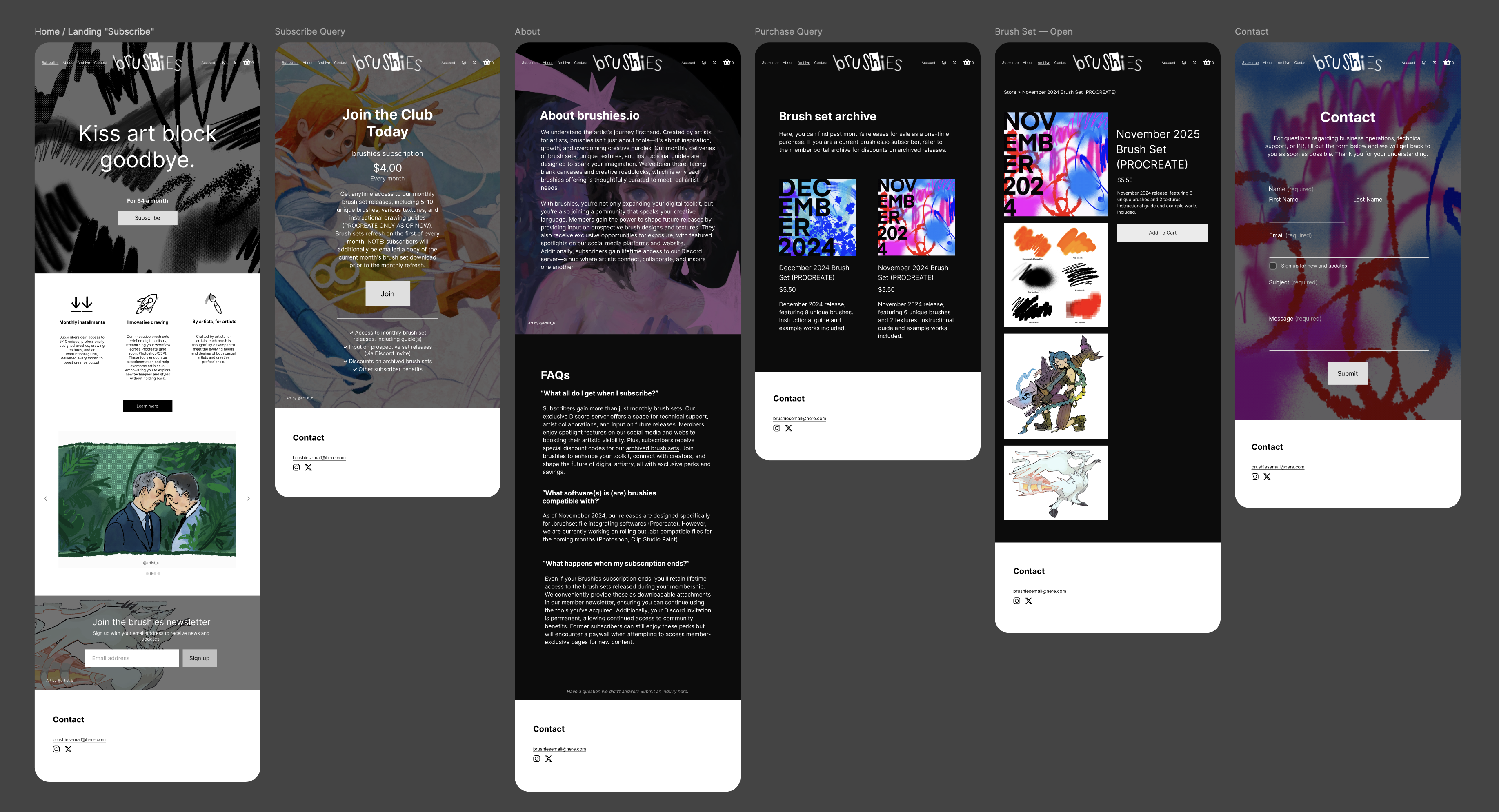
Aligned with my research, the newly drafted pages of the Brushies website feature higher contrast and clearer information hierarchy. A revamped about page now includes FAQs and an invitation to submit inquiries, linking directly to the contact page. Additionally, the site introduces three subscriber-only internal pages, allowing members to download files and access promotions without leaving the site (see second figure).
Note: paper wireframes and desktop mockups not included for brevity.
User Feedback and Iterating
Validating the design: is it actually working for users?
I called back a handful of participants from my usability test to verify that the new design streamlined processes that originally proved to be inefficient. In lieu of another usability study here, I instead presented my mockup to participants directly to confirm viability. After, I organized my findings into three different categories (see figure below).
Interestingly, the majority of participants had recommendations beyond just navigation this time around—comments regarding Brushies' digital subscription content and offerings.
High-Fidelity Mockups and Prototyping
Revising the design based on mockup user feedback
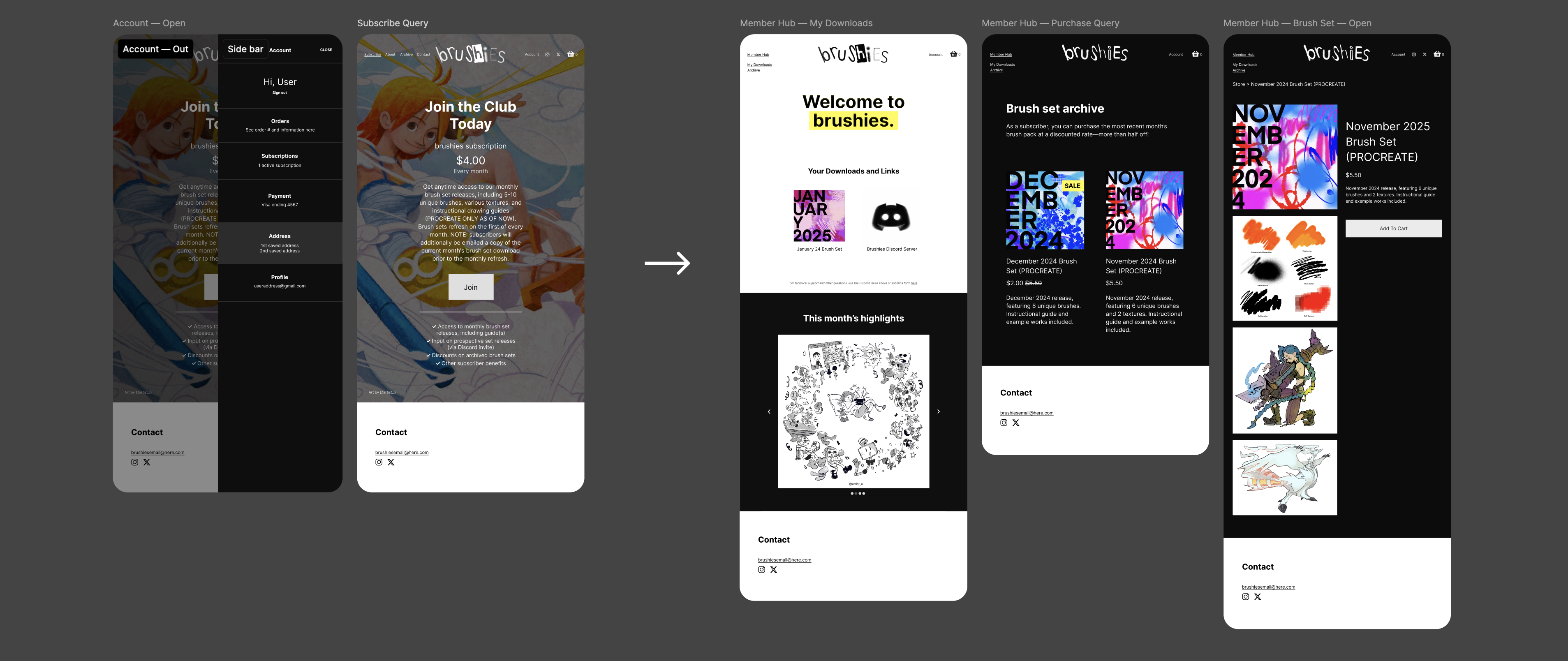
Improved pages and navigation
The high-fidelity mockups and prototype support smooth navigation through high-contrast calls-to-action and a clearer visual hierarchy. Animated GIFs (screens 1 and 4 below) are now integreated to enhance interactivity—an improvement directly informed by my usability study findings.
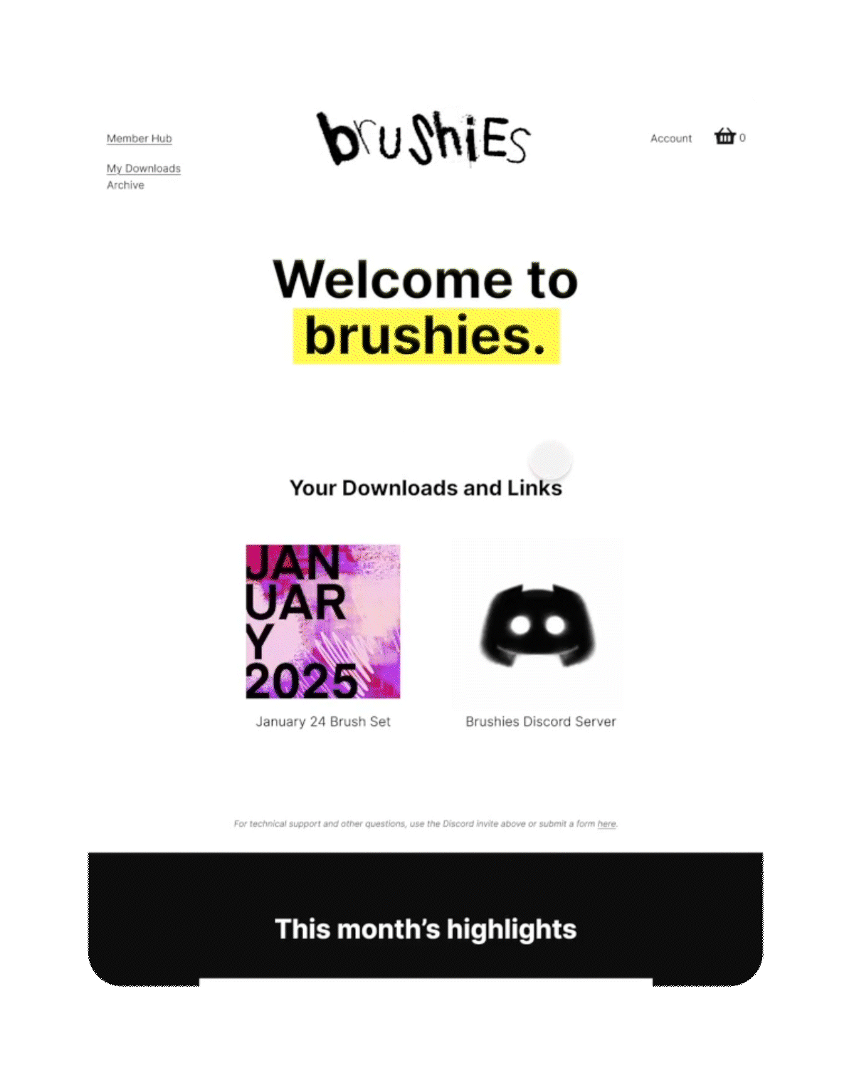
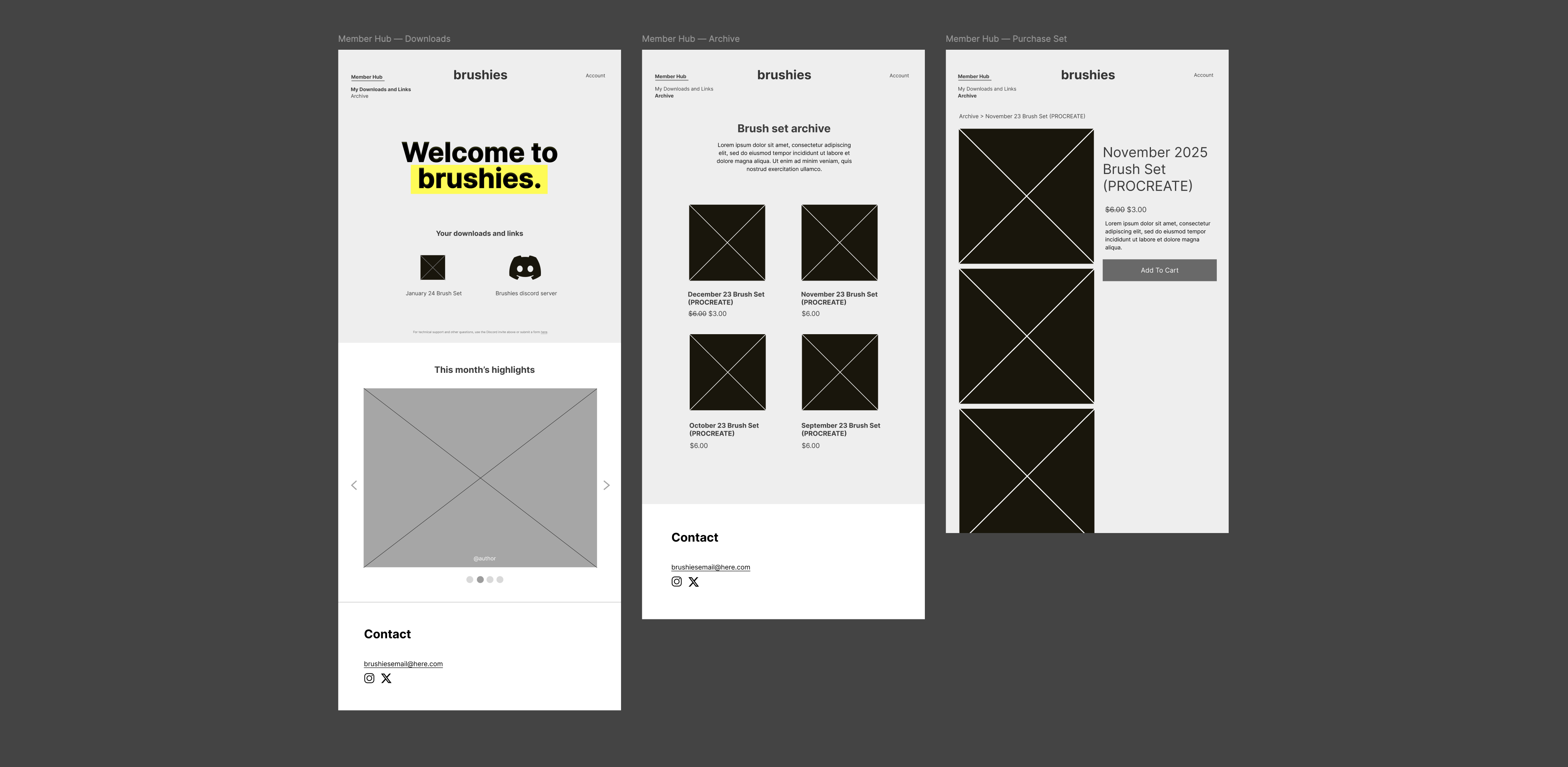
Built-in subscriber portal
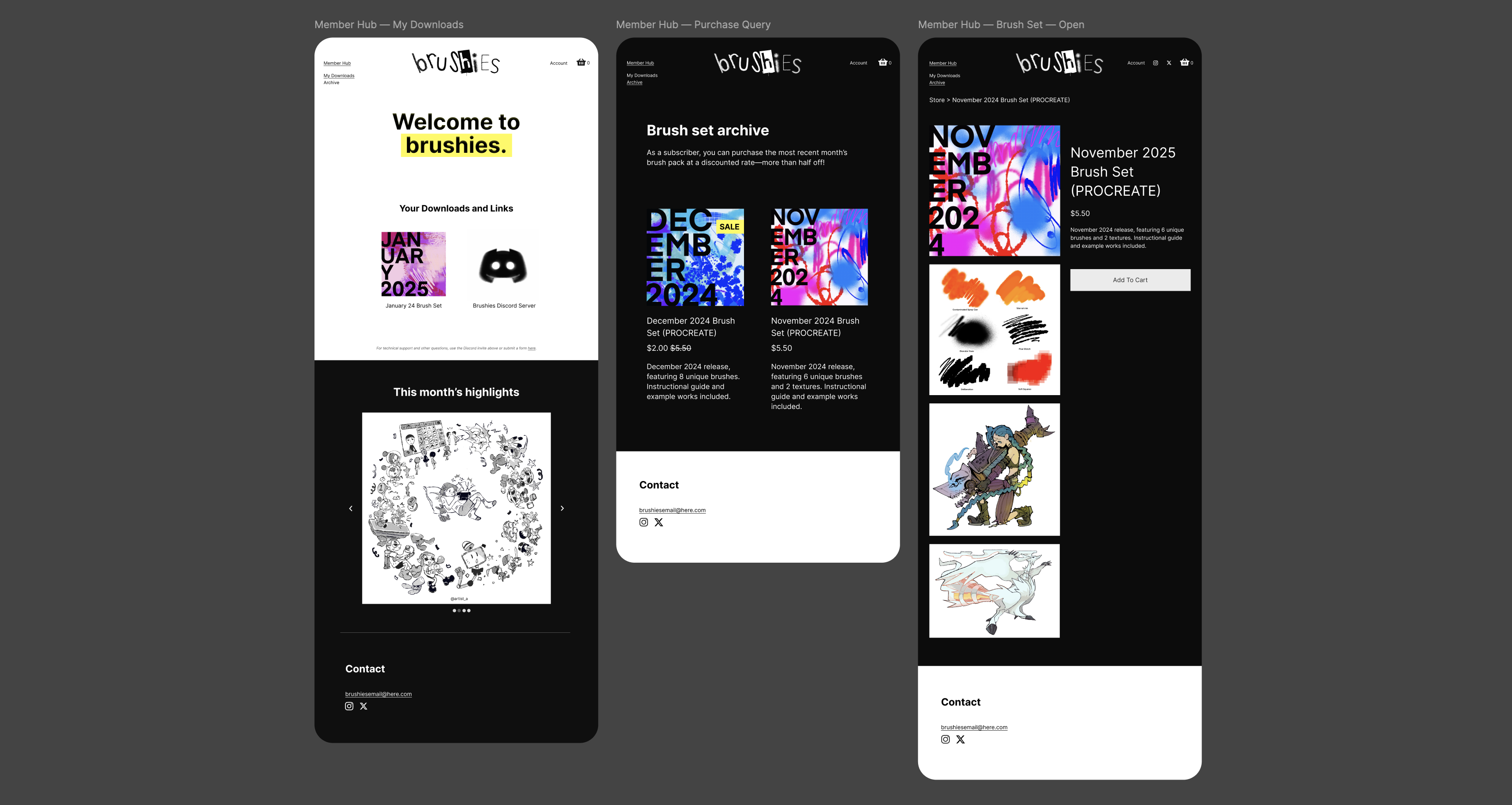
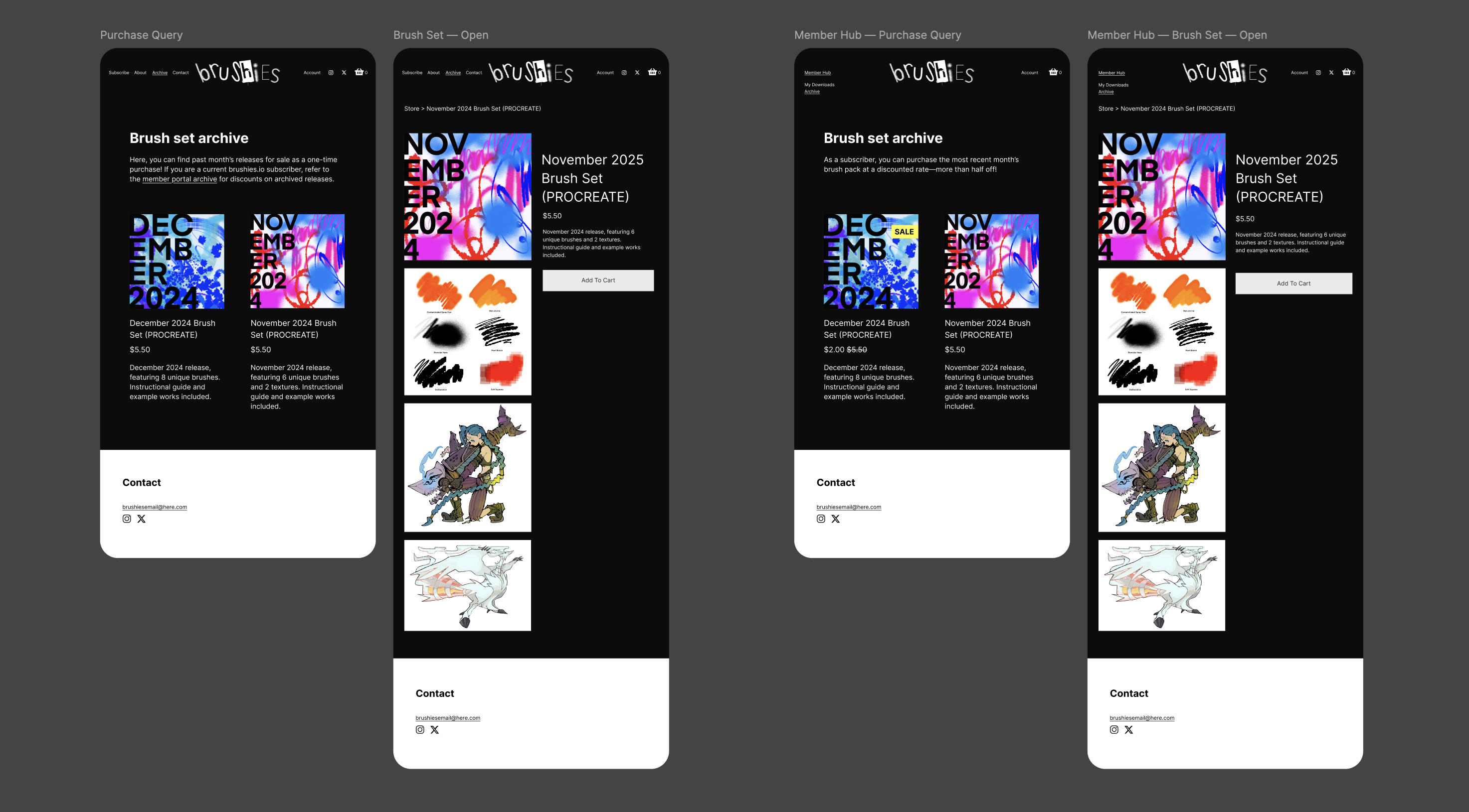
In line with user research findings, Brushies now includes internal pages that become accessible only once a user subscribes. The site matches a subscription ID to an account accordingly to unlock the portal’s three screens. Here, users can access their monthly downloads, join the community Discord server, and purchase archived brush sets at a discounted price.
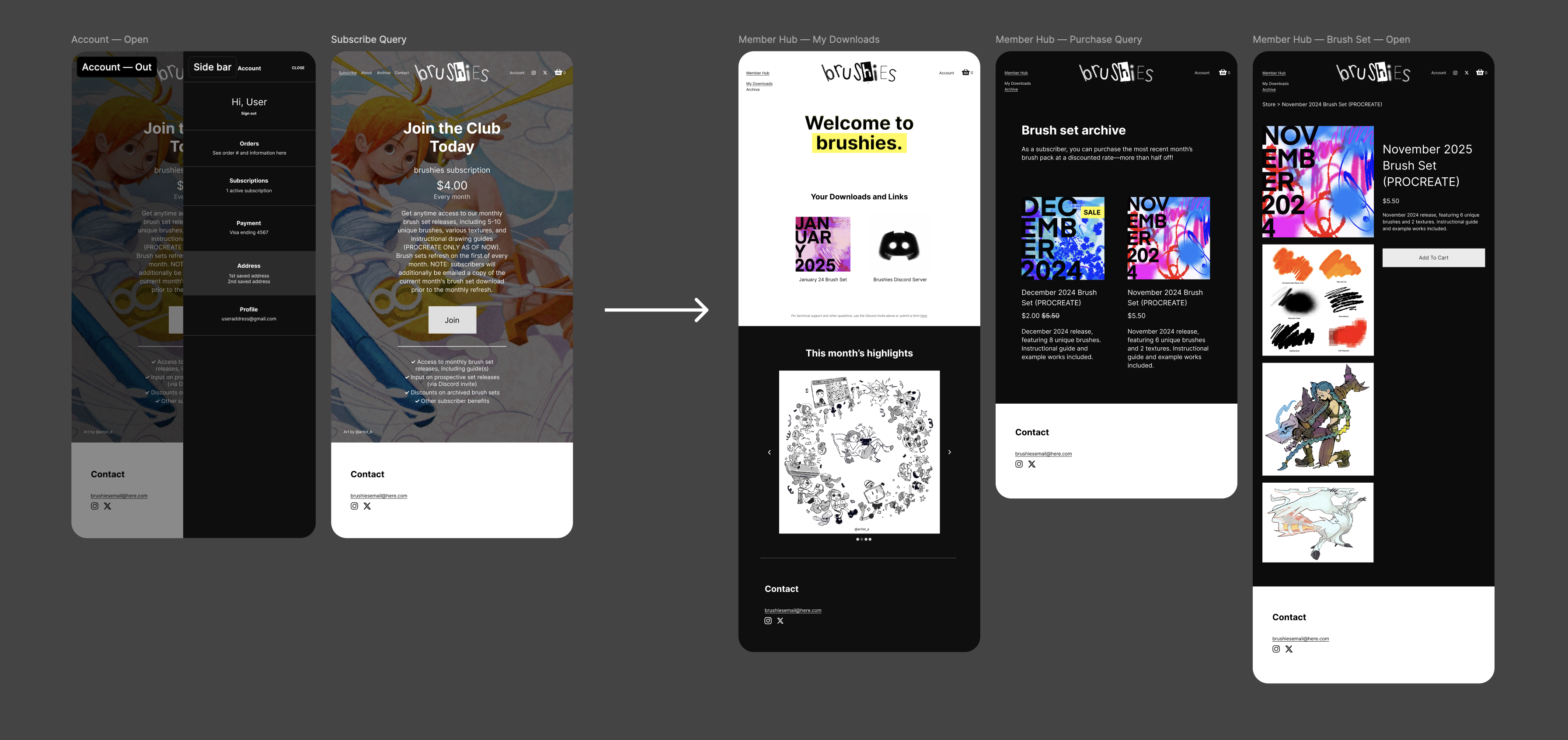
User-backed product expansion
While originally only available for subscribers to purchase, archived brush sets have been extended to non-subscribers. To incentivize the subscription, Brushies maintains promotions on these sets within the member portal.
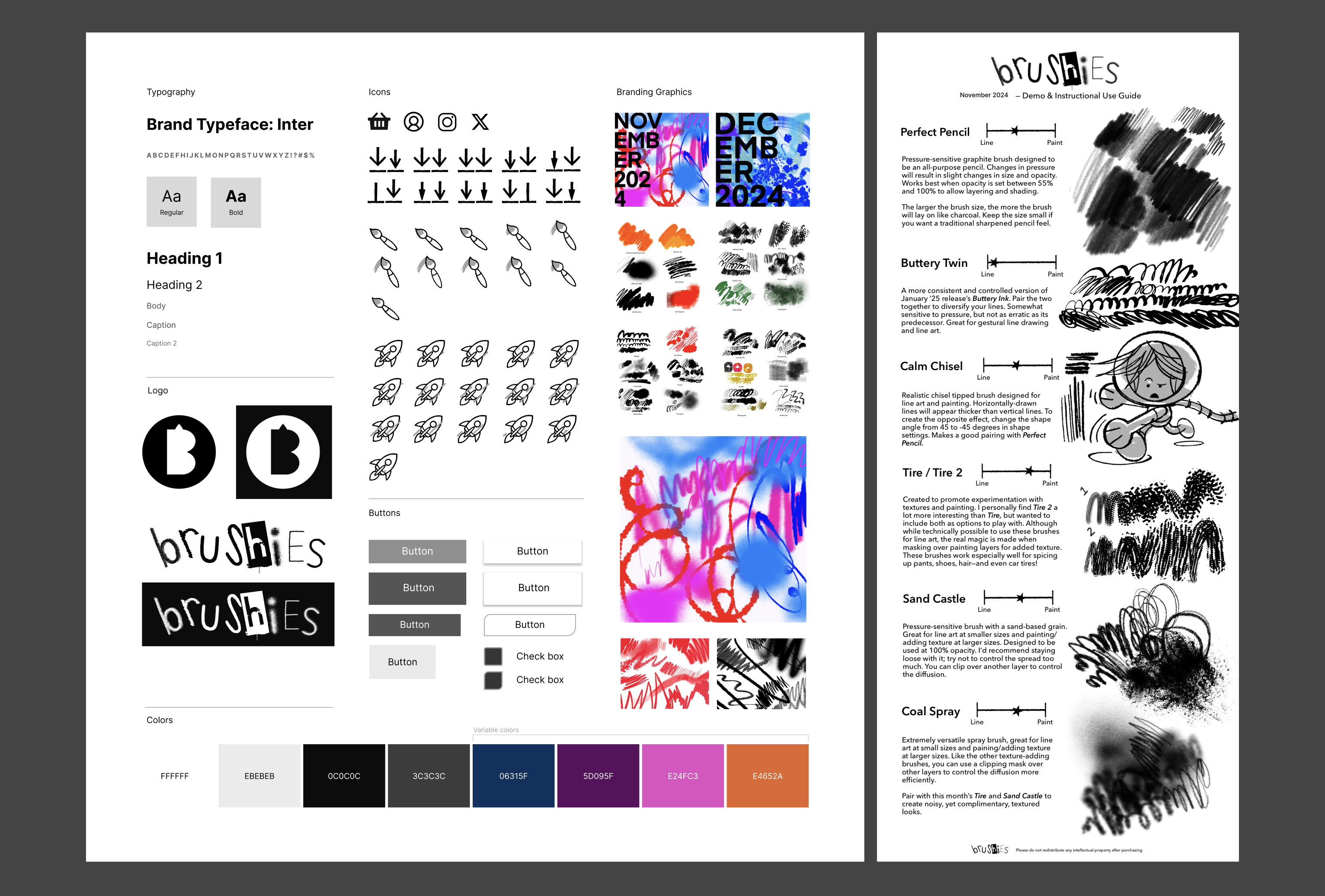
Updated design system
Revisions to color, typography, iconography, and imagery. The left figure depicts site design, while the right depicts layout of downloadable visual content.
4. Iterate
Usability Study, Pt. 2
Conducting a second moderated usability study to see how users interact with the new design iteration
Following the completion of my high-fidelity prototype, I began preparation for a second usability study to measure the degree by which my design goals were fulfilled. For this study, I recruited six new participants, again, from a representative pool of digital artists. I included the same screening survey as before to ensure the study captured a diverse range of ages and accessibility needs.
This time around, I prepared a brief six step itinerary to minimize my own personal bias and encourage user transparency (see figure below).
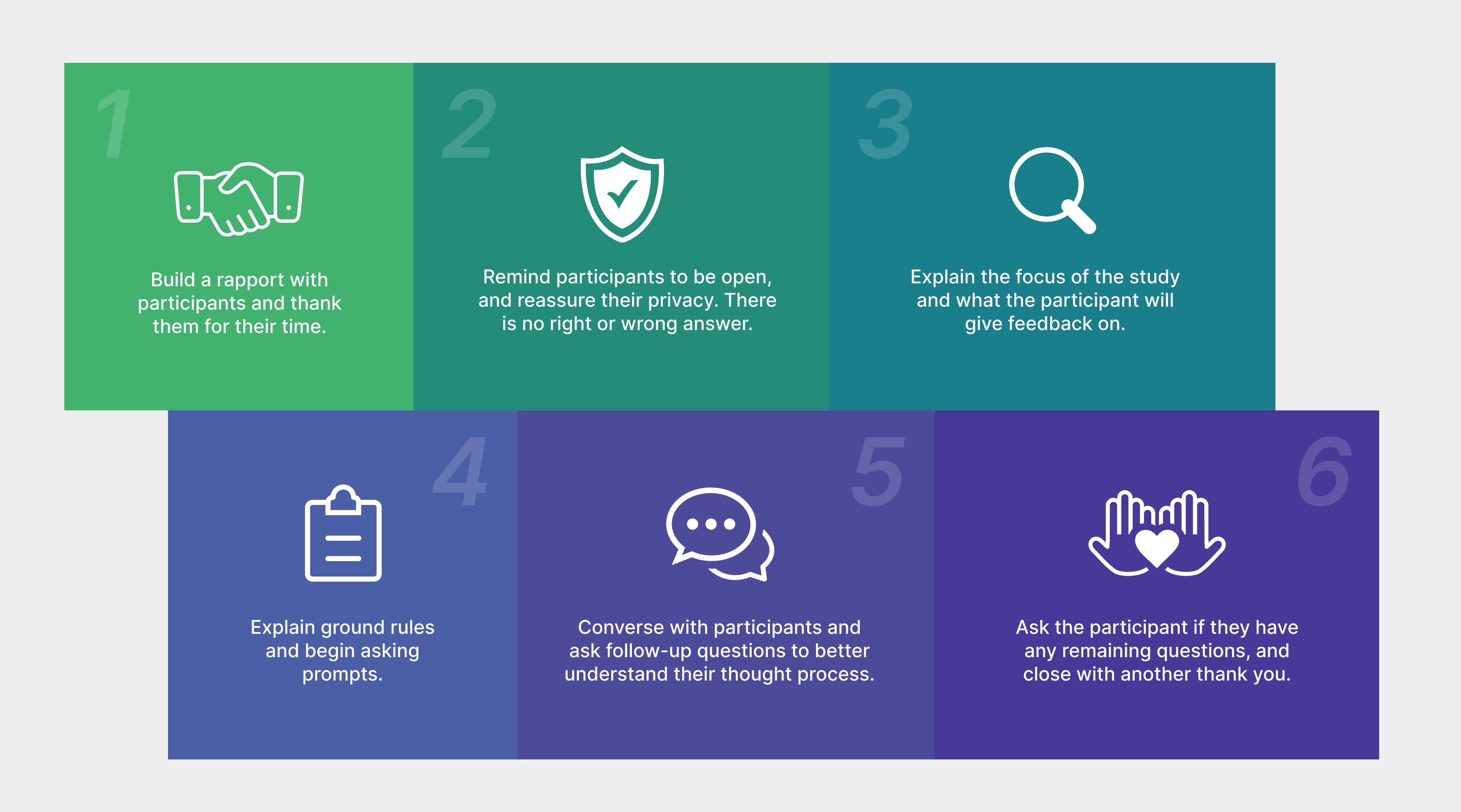
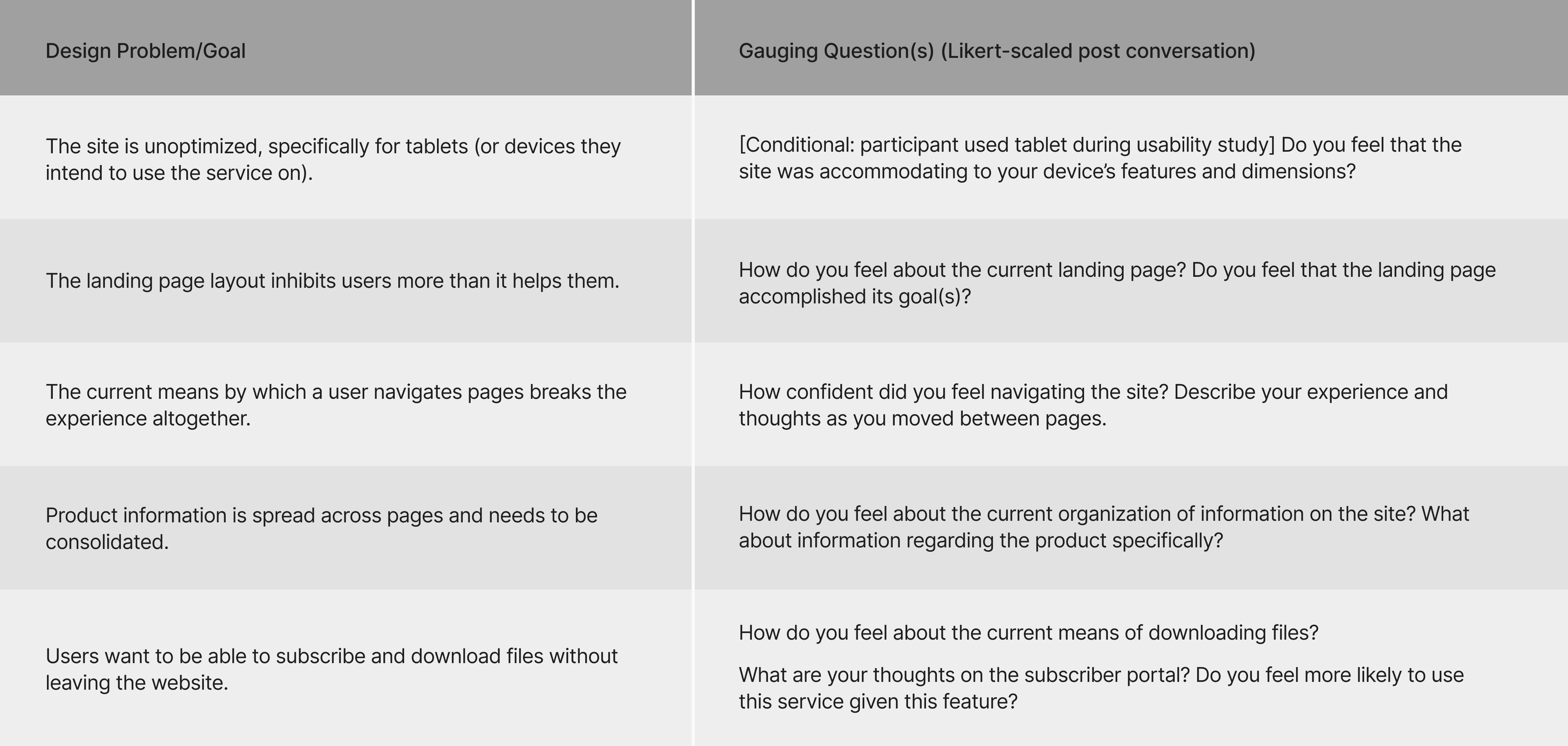
I organized the five design problem statements from earlier and paired each with questions to assess the progress made so far. Participant responses would later be rated on a 1–5 Likert scale, based on the language and tone of their feedback.
Analyzing Results
Quantifying progress on design goals
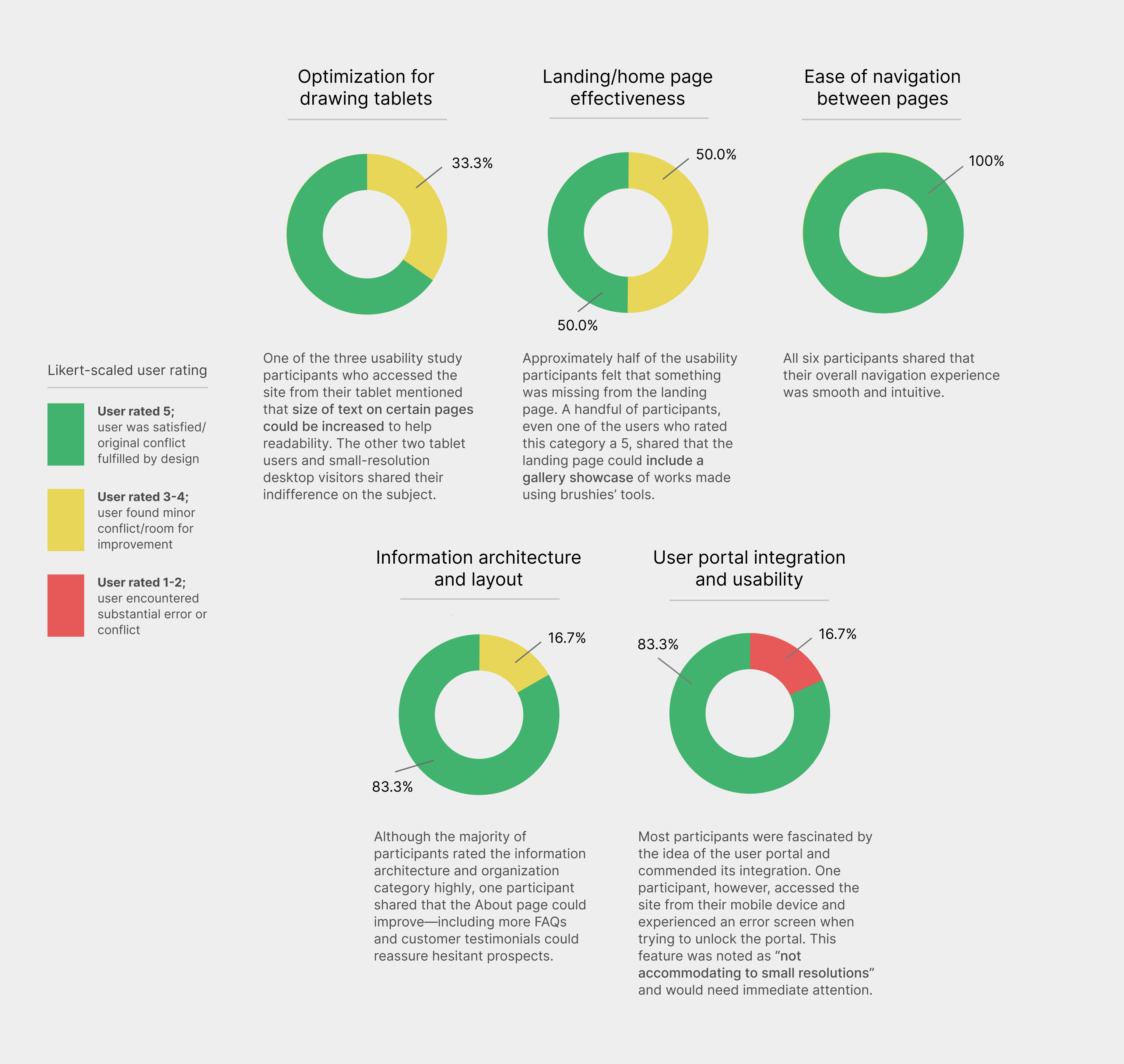
From observing participants, I found that significant progress had been made in improving the overall user experience of the Brushies website. However, as reflected in the graphics above, many of the design goals outlined earlier still required further attention.
After organizing the rest of my usability study notes in a separate document, I began the next iteration of my design.
01
Redesign
Iterating the design based on user conversations and insights
Insight: typography elements are unoptimized for certain mid-size displays
Results from the usability study indicated that tablets and small laptops displayed “awkward” font sizes and formatting on certain screens. This was due to the fact that the site was made responsive to a </>= resolution value, and overlooked intermediary screen sizes.
The new iteration addresses this issue by creating a third resolution range specific to these devices, with updates to styling.
02
Insight: the landing page lacks impact and could benefit from an additional feature
Participants in the usability study felt that the landing page was missing a key element that could have enhanced their overall experience: an interactive gallery of artworks made using Brushies’ tools. Including a gallery on the landing page allows prospective subscribers to quickly view the service’s results without the need for extra navigation.
The new iteration integrates an automated carousel allowing users to see the power of Brushies.
03
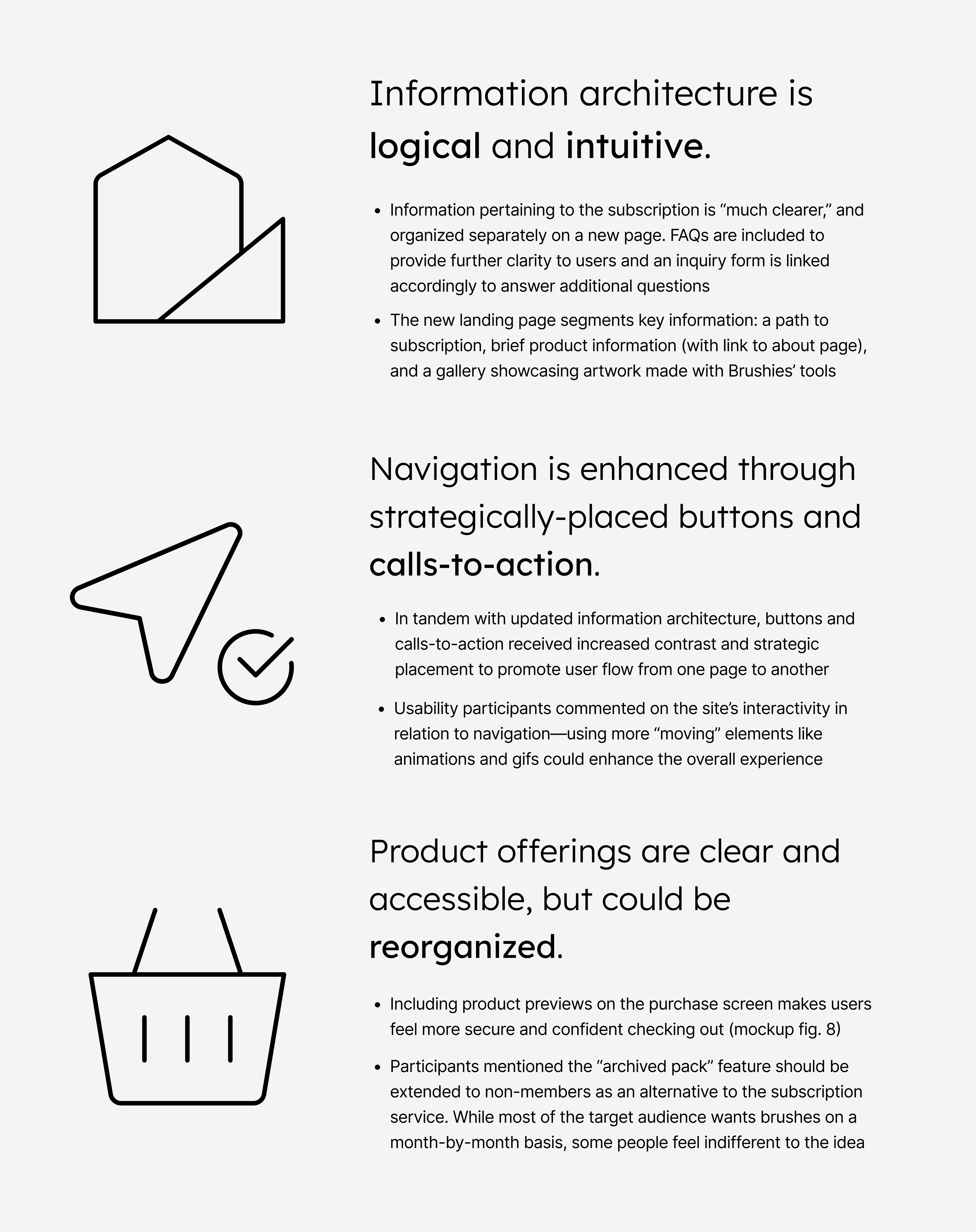
Insight: information architecture and user portal integration need additional tweaking
While most users found the website’s structure logical and intuitive, research showed there was still room for improvement. Participants wanted the About section expanded to help clear up lingering confusion. There was also an urgent need to fix the issue preventing mobile users from accessing the user portal.
The new iteration of the site corrects the issue with accessing the user portal on mobile devices and makes minor formatting improvements across all pages.
5. Rollout & Reflection
Revised Prototype
Iterating until a design is approved by users
Included below is a compilation of all user-approved screens. But wait—the design doesn't stop here! After release, the design will continue to undergo iteration to ensure it aligns with users’ evolving needs.
By the time you're reading this, it's likely an updated version of Brushies will be live here.
Note: some secondary screens not included for brevity.
Reflection and Takeaways
1. Fighting personal bias as a stakeholder—and why it's essential
It's easy to get caught in your own head while iterating. As a digital artist, I found myself trapped time and time again in tunnel vision, consumed by site ideas and designs that reflected only what I wanted to see. The first step toward better design is recognizing a simple truth: even if you relate to your users, you are still just one planet in a vast solar system. The sun, representing the core of good design, must cast light on every planet, each with its own unique atmosphere, distance, and speed. Designing for just one leaves the rest in darkness—cold, disconnected, and uninhabitable.
2. Letting users take the wheel sometimes
Your oversight on a project is your freedom; the formula by which you design, engage with participants, and structure the project is entirely under your control. Despite this, working on Brushies taught me something invaluable: sometimes your users come up with the best, brightest ideas, you just have to let them know the floor is theirs. Ensuring a comfortable environment and building a rapport will encourage them to say what's really on their mind.
3. Beginning with an existing system
Since Brushies already had a lightly tested, live version of its site running before I began this project, I expected things to be relatively hands-off and smooth sailing… or maybe I just wanted things to be that way. Hearing users speak about all the improvements they wanted to see on the site made me realize I’d need to strip Brushies down to its foundation, that is, to build something better. The most important part of improving the user experience is hearing users out, even if that means skipping the shortcut.
Huge shoutout to Sarah Mei for inspiring this case study layout!