
Social that puts people first.
About Bluesky
Designed for users who value autonomy and transparency, Bluesky is a thread-based social platform that is completely decentralized—no single company owns it thanks to its AT Protocol. Users have full control over their content and identity, choosing what they see instead of relying on a top-down algorithm.
My role
UI Designer,
UX Designer
Tools
Figma,
Qualtrics
Timeline
Simulated design sprint (1 week)
1. Overview
Problem
Despite early buzz as a decentralized alternative, Bluesky struggles with user acquisition and retention, partially due to limited accessibility and a UX that obscures its core value.
Forums online frequently criticize Bluesky’s UX for failing to communicate the benefits of its decentralized model, alongside limited customization, and accessibility that lags behind Twitter/X and Threads. These issues highlight a clear need for a more inclusive, user-centered design that meets modern usability standards.
Solution
To encourage Bluesky’s adoption, I designed and integrated tools that introduce users to the platform’s innovative architecture, offer enhanced customization, and expand accessibility.
Bluesky’s updated design introduces an onboarding carousel and inline tooltips to help users understand the platform’s unique architecture—its core value—alongside media filtering and enhanced accessibility tools. Backed by research, these additions aim to reduce confusion and address common points of friction.
Transparent
AT Protocol onboarding for new users
The new design introduces a brief onboarding and inline tooltips highlighting Bluesky’s decentralized architecture, ensuring users understand what makes the platform unique—and how it protects their digital autonomy.
Customizable
Advanced filters for more control
Bluesky puts the power in your hands, letting you build your own content-sorting algorithm as you use the app. Now, with filters based on text and visual keywords, users can further fine-tune their feeds to match their preferences.
Accessible
Additional features for visually impaired users
Users with greater accessibility needs represent a vital part of both Bluesky’s current and potential community. By including adaptable tools like editable alt text and customizable sliders for contrast and font size, we ensure these users feel valued and included.
2. Research
Preliminary Research
Identifying UI and accessibility gaps from user commentary across digital platforms
I started this project by exploring Bluesky’s UX challenges to identify areas for improvement.
In lieu of user interviews, I gathered insights by scanning various online forums and discussion boards, identifying common UX themes, trends, and frustrations. This approach was meant to simulate real-world time constraints, where conducting and synthesizing primary research may not always be practical.
To avoid any potential self-serving biases, I gathered findings from multiple independent sources, ensuring the discussions weren’t skewed toward any particular viewpoint or user demographic. Additionally, I ensured that my search queries were neutral, avoiding language that could introduce confirmation bias or reflect preexisting judgments.
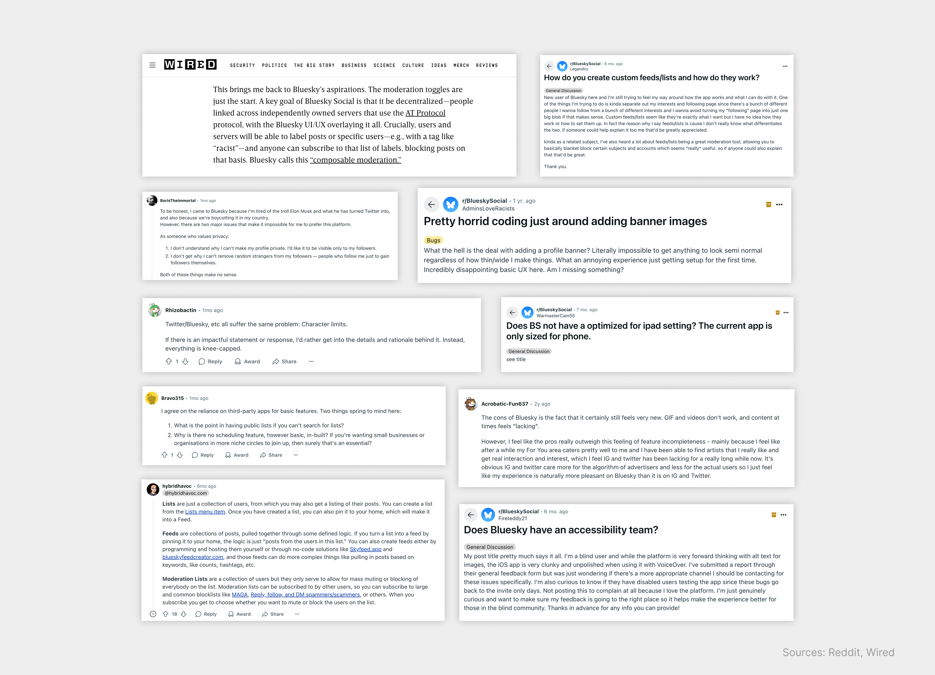
The truth is, a lot of users are leaving Twitter/X and Meta-owned socials due to centralized data handling and digital tyranny. Perfect—so Bluesky must be capitalizing on its own architecture to draw in the crowds? Not exactly. After scanning online threads and articles, I noticed that the most frequent complaint with Bluesky is its inability to convey its own value—that is, to inform users of its decentralized AT Protocol and how it works. According to users, the app and website fail to clearly communicate that Bluesky is, by design, a platform built for digital freedom. What’s more, its current design system unintentionally echoes the aesthetic of Twitter/X, making it harder for users to see the uniqueness of Bluesky.
User posts also highlighted a few other common pain points, including Bluesky’s lack of basic features like filtering lists and scheduling
posts, as well as its incompatibility with screen
readers.
In the end, three issues stood out as the most significant sources of UX frictions, as reported by users:
1
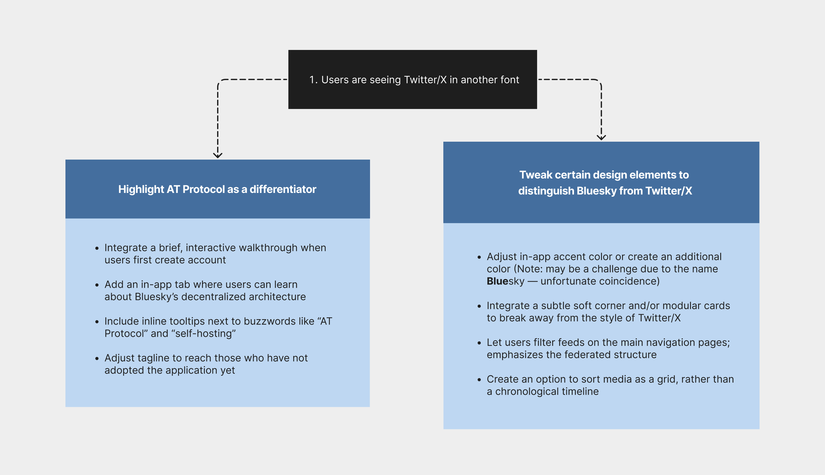
Users are seeing Twitter/X in another font.
Why switch to a copycat of your more popular platform? Users are seeing the same thing when they move—the same layout and colors. Further, users aren’t clearly informed about the AT Protocol or its benefits, making it difficult for them to distinguish Bluesky from Twitter/X.
2
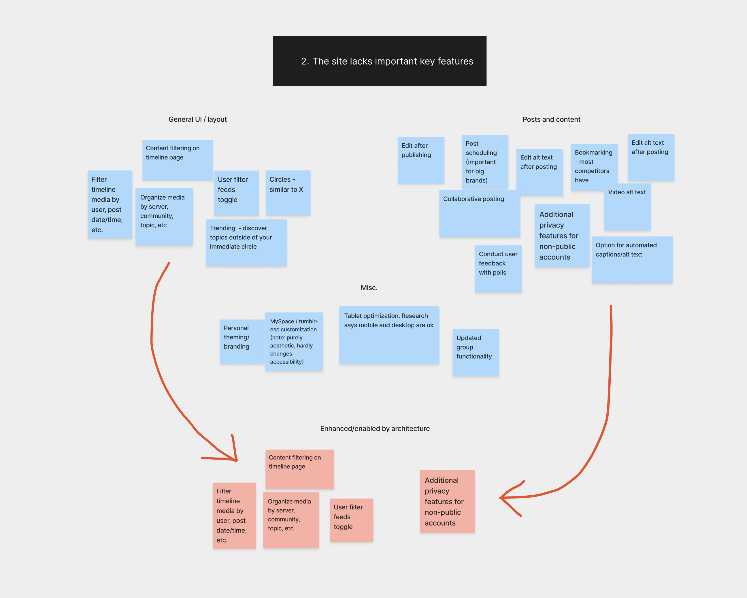
The site lacks important key features.
For a company that champions user freedom, Bluesky falls short on basic features that would improve accessibility and usability. From poor tablet optimization to the inability to schedule or edit posts, the platform overlooks fundamental user needs.
3
Accessibility support is lacking for people with (primarily) visual impairments.
Bluesky lacks built-in alt text display, forcing impaired users to rely on third-party tools for image and video posts. Additionally, the app's three avaialble font size options are marginally different, making it unnavigable for those needing higher contrast.
Empathizing
Understanding our users and the importance of accessibility through personas and journey maps
It’s no surprise that most social media platforms offer extensive accessibility features and support third-party screen readers, given the size and diversity of their user bases.
To stress the importance of accessible design, I created a Bluesky persona to visualize what daily life might look like for a user with a disability.
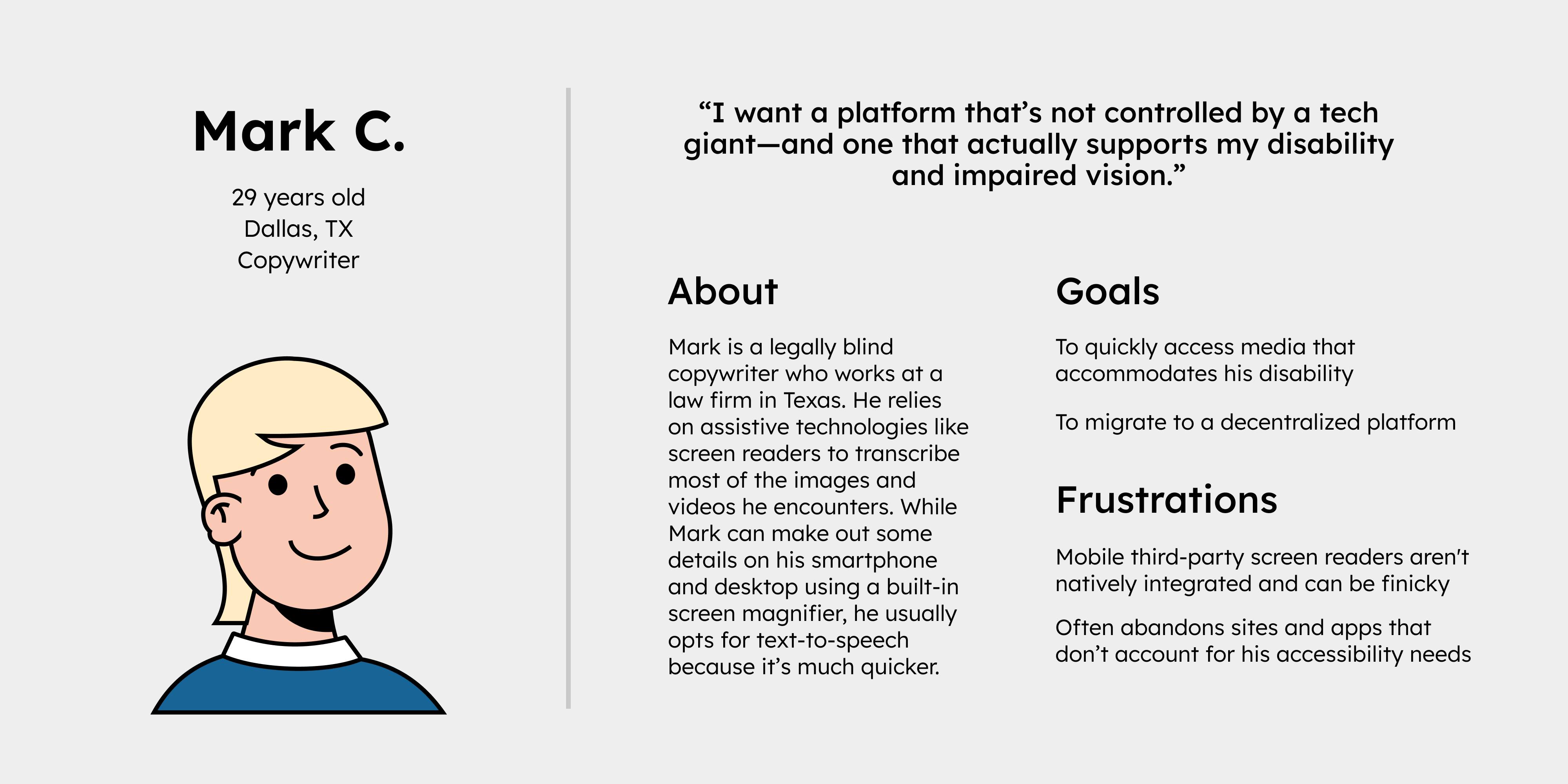
While research indicates that Bluesky is mostly accessible, its alt text and font/contrast settings still need improvement to better serve users like Adam.
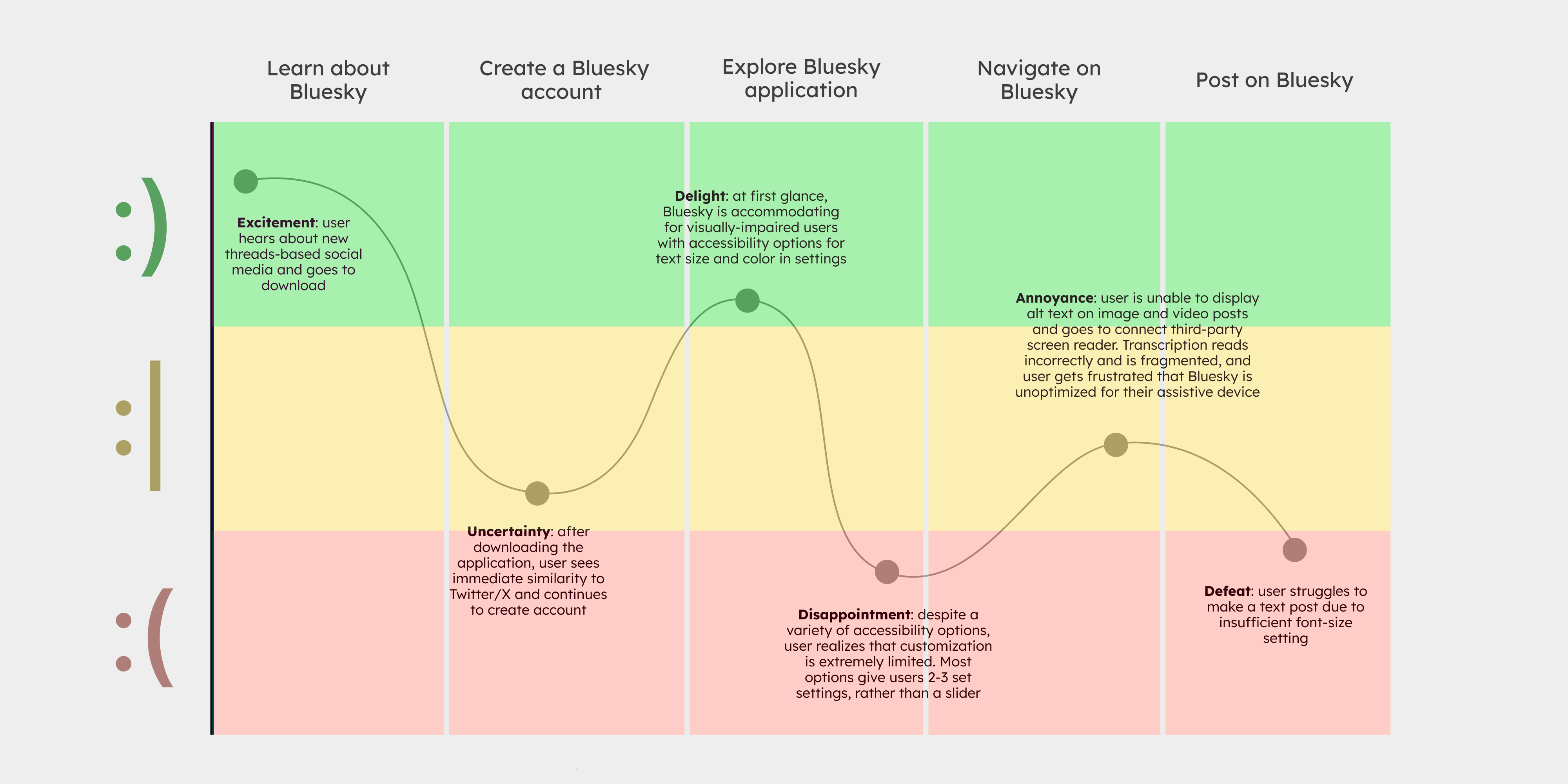
To empathize further, I created a journey map illustrating how a user with a visual impairment might interact with Bluesky over time. It’s important to note that accessibility isn’t binary—it exists on a spectrum, meaning users have different journeys based on their individual needs.
Competitive Analysis
Examining how other platforms support and enhance accessibility for visually impaired users
To support an accessible migration to Bluesky, I analyzed how major platforms like Meta design inclusive scrolling interfaces and leverage accessibility-focused extensions.
While desktop browsers support a range of visually-assistive extensions—such as ChromeVox, Read Aloud, and Helperbird—accessibility is handled differently on mobile devices with app-based operating systems. For example, mobile versions of Threads and Twitter/X offer in-app accessibility options, since users typically can't install extensions on these devices.
My review of accessibility practices across competing social platforms led to the following insights:
1. Automated alt text generation makes more content accessible
2. Visual customization settings work better with sliders, rather than set options
3. Editable captions and alt text ensures content remains accessible when mistakes or omissions happen
4. Applications should honor system settings that reduce motion and animations
5. High-contrast theme options improve readability for all users
3. Ideation
Brainstorming
Exploring various UI and accessibility-improving features
Now, with a strong understanding of what deters interested users from migrating to Bluesky, I began exploring UX-driven strategies to incentivize adoption.
To address the first UX issue identified—Bluesky’s resemblance to Twitter/X—I brainstormed a two-part UX initiative: first, highlighting Bluesky’s AT Protocol as a key value proposition; and second, adjusting visual and interaction design elements help users perceive Bluesky as distinct from Twitter/X.
To address the second UX issue—the absence of key social media features—I created a FigJam sticky note dashboard to visualize a range of potential features and began grouping those that aligned best with the platform’s goals and user needs. For this part, I wanted to prioritize essential features (according to users online) that are supported by Bluesky’s unique architecture and unavailable on competing platforms.
While I aimed to explore a wide range of ideas, I also made sure that my brainstorming was grounded in research and real user needs. Staying concise was especially important here—too many unnecessary features could lead to feature fatigue and overwhelm users (see the Design section for the finalized features).
For the third UX issue—insufficient accessibility support for select users—I conducted a competitive feature audit and organized my findings in Figma. During this phase of ideation, I focused on the five key accessibility insights identified earlier, exploring ways to improve visual customization and implement more adaptable alt text support. This chart helped me identify where competing social platforms excel in accessibility, as well as where they fall short, highlighting opportunities for Bluesky to stand out and lead in this space.
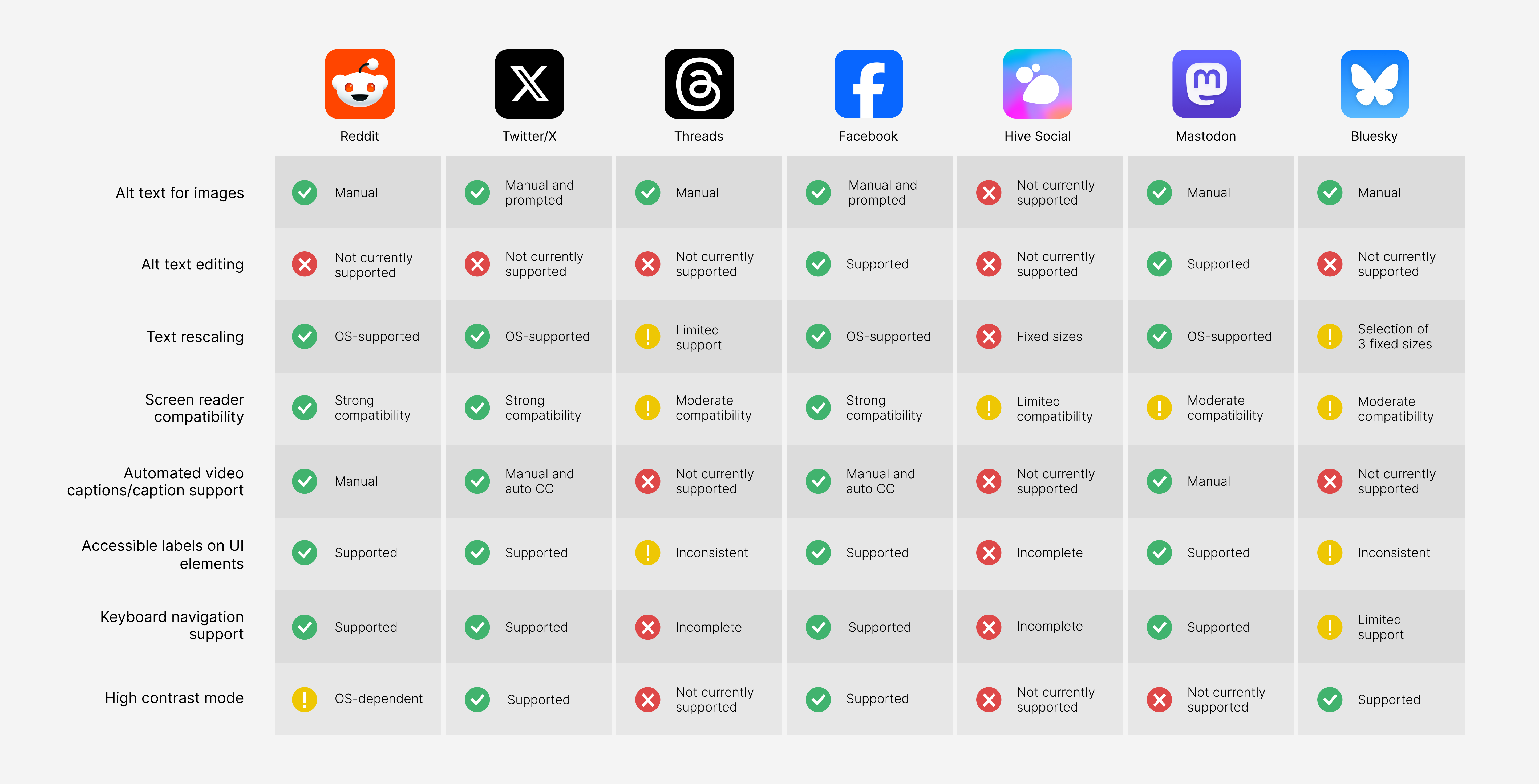
Expanding accessibility is essential for a company like Bluesky—a platform dedicated to user privacy and autonomy—though some features are considerably more challenging to implement than others. For example, automating text captions for videos may require advanced external services such as speech-to-text APIs or server-side processing, whereas text rescaling can typically be handled within the app’s front-end architecture.
After careful consideration, I decided on the following core features:
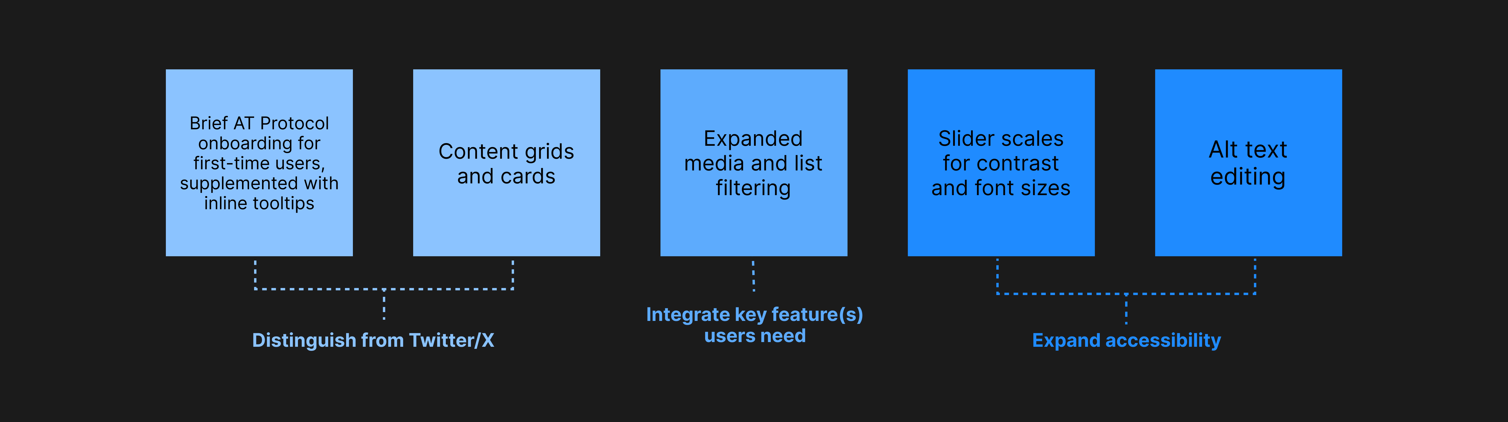
4. Design
Design & Prototype Results
Transforming paper wireframes into high-fidelity prototypes
After deciding which core features to implement, I sketched paper wireframes and quickly tested them with a group of six participants. Using their feedback, I rapidly iterated on the designs in Figma. Thanks to Bluesky's existing design system, these updates were implemented efficiently, keeping the project on track within its time constraints.
Since the vast majority of Bluesky users access the app on handheld devices, I adopted the mobile-first philosphy, progressively scaling the design upward for tablet screen sizes.
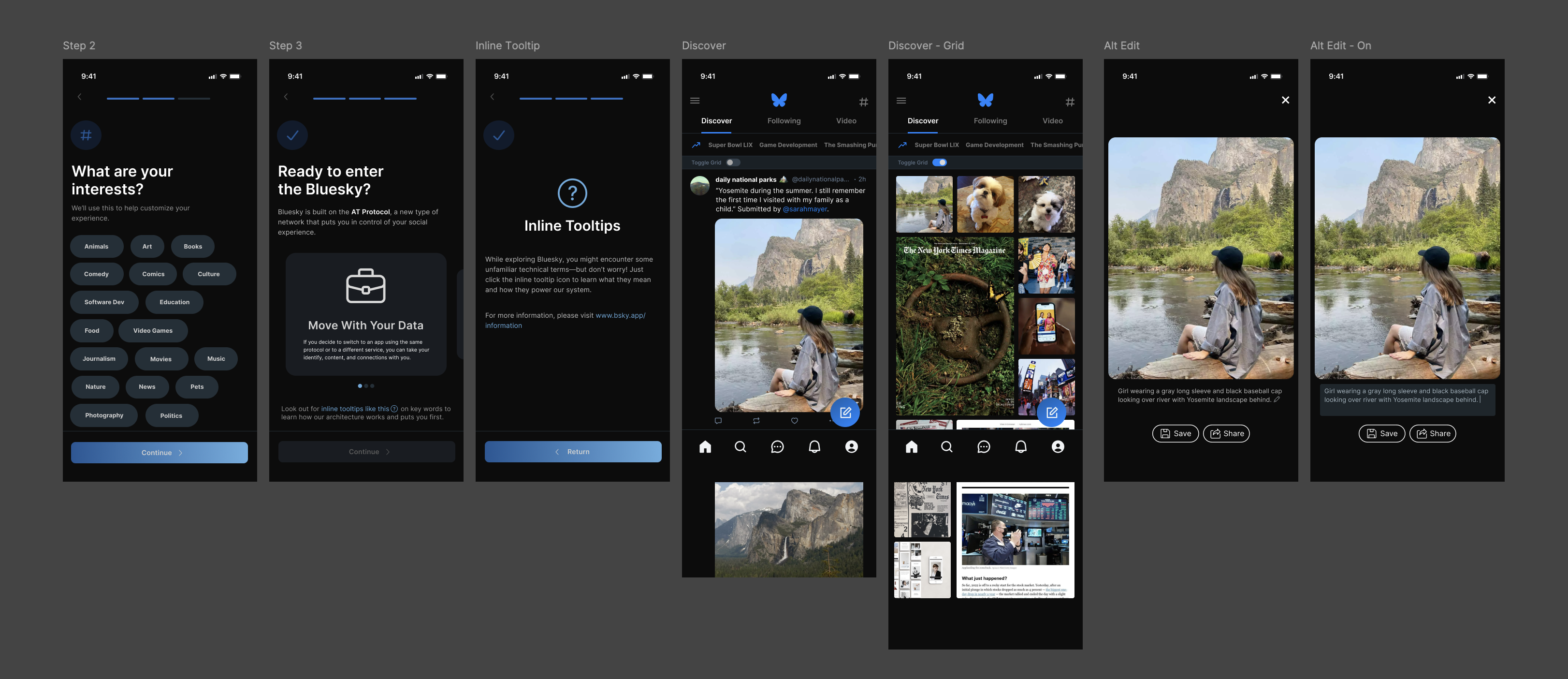
01
Redesign, Part 1
Defining Bluesky: educating users and providing a new display option
Paper Wireframe
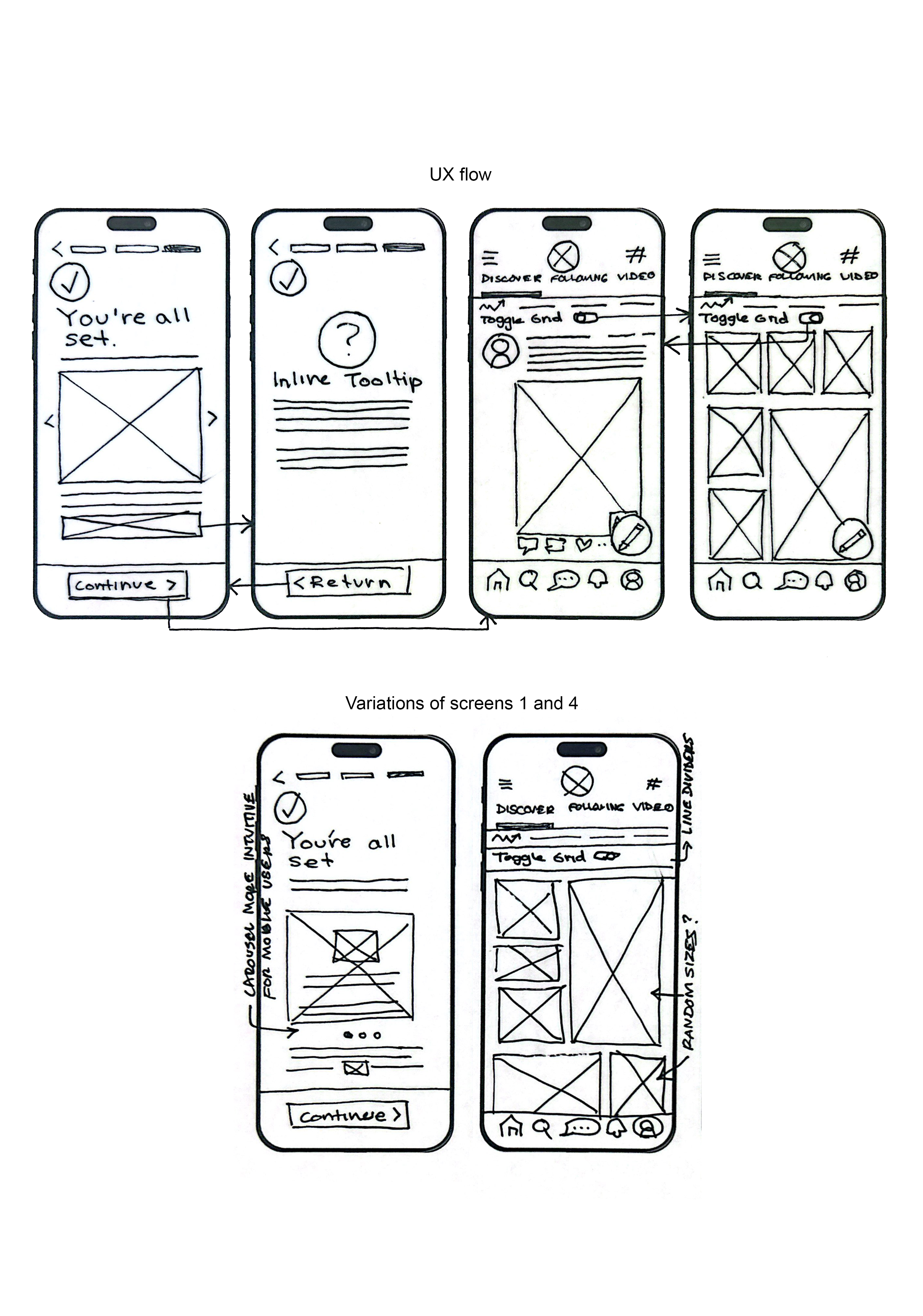
Final Prototype
Approach
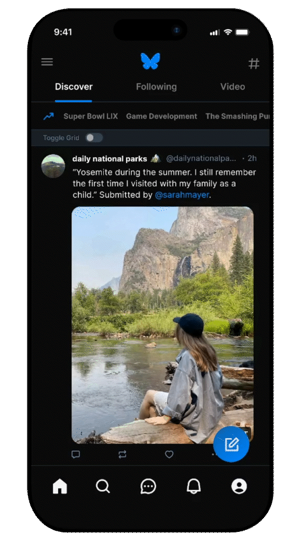
To help Bluesky stand apart from Twitter/X—something users felt was lacking—I added AT Protocol educational tools alongside a new media grid view option. Many Reddit users said they deleted the app because they didn’t ‘feel’—or rather—‘understand’ how it was different from Twitter. This redesign aims to briefly onboard new users with AT Protocol concepts while also providing inline tooltips for those who want to learn more. Additionally, many users noted that the media browsing experience felt too similar to Twitter’s timeline. The grid view offers a fresh way to explore content, while still giving users the choice to view it in a familiar timeline format.
02
Redesign, Part 2
Applying filters to media, enabled by Bluesky's architecture
Paper Wireframe
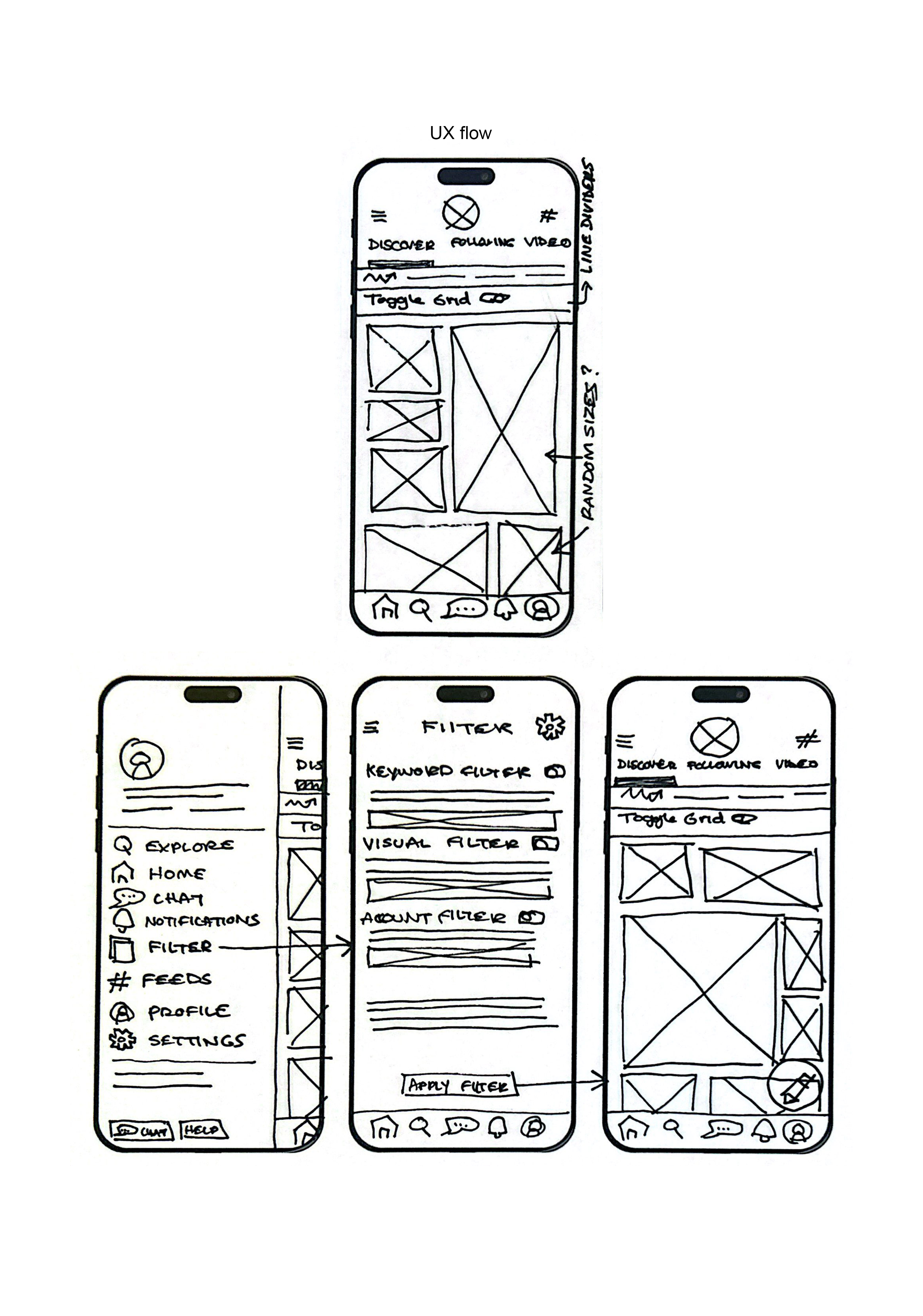
Final Prototype
Approach
Research indicates that many people left Twitter/X when it breached their digital autonomy—essentially forcing them to consume content outside of their personal algorithm. This sparked widespread discussions about transparency and customization as essential features of social media, not just nice-to-haves.
Building on Bluesky’s community-controlled appeal, this redesign lets users further tailor their experience by toggling on a variety of algorithmic filters. For this specific design iteration, users can set text and visual keywords, as well as select account topics to fine-tune their feeds.
03
Redesign, Part 3
Expanding and improving accessibility through alt text and appearance
Paper Wireframe
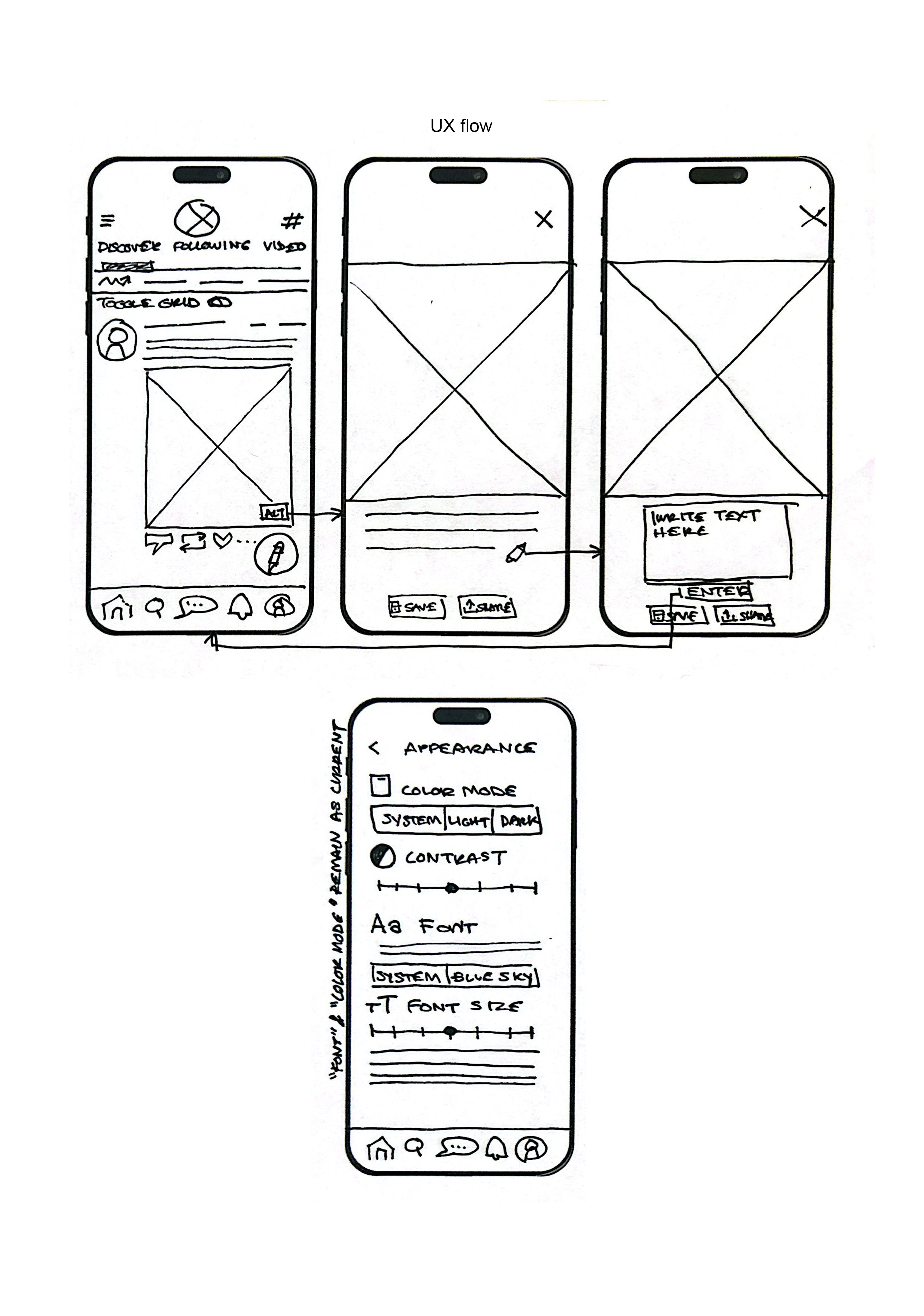
Final Prototype
Approach
When it comes to making everyone feel welcome on a new platform, research highlights the importance of enhanced visual customization—particularly features that cater to users with visual impairments. The redesign introduces a two-pronged approach: first, enabling users to add or edit alt text that might be missing or incorrect, and second, incorporating sliders for adjusting contrast and font size settings.
The first feature is often overlooked by larger platforms but has been frequently cited in Bluesky’s Reddit forums as “essential” for accessibility. Giving users the ability to correct or add alt text significantly broadens access to media content. Meanwhile, customizable sliders for contrast and text size allow users to fine-tune their viewing experience to their needs, eliminating the limitations of preset options.
5. Reflection
Final Screens & Components
Talking to users and gathering insights
After incorporating the features outlined in the previous section, I re-engaged a select group of users from my initial paper wireframe testing—this time to gather feedback on my high-fidelity digital prototypes.
Overall, users responded positively to the improvements in functionality and accessibility, especially given the project constraints. Many described the additional screens as “intuitive” and “necessary,” while some even offered suggestions for future iterations of the redesign.
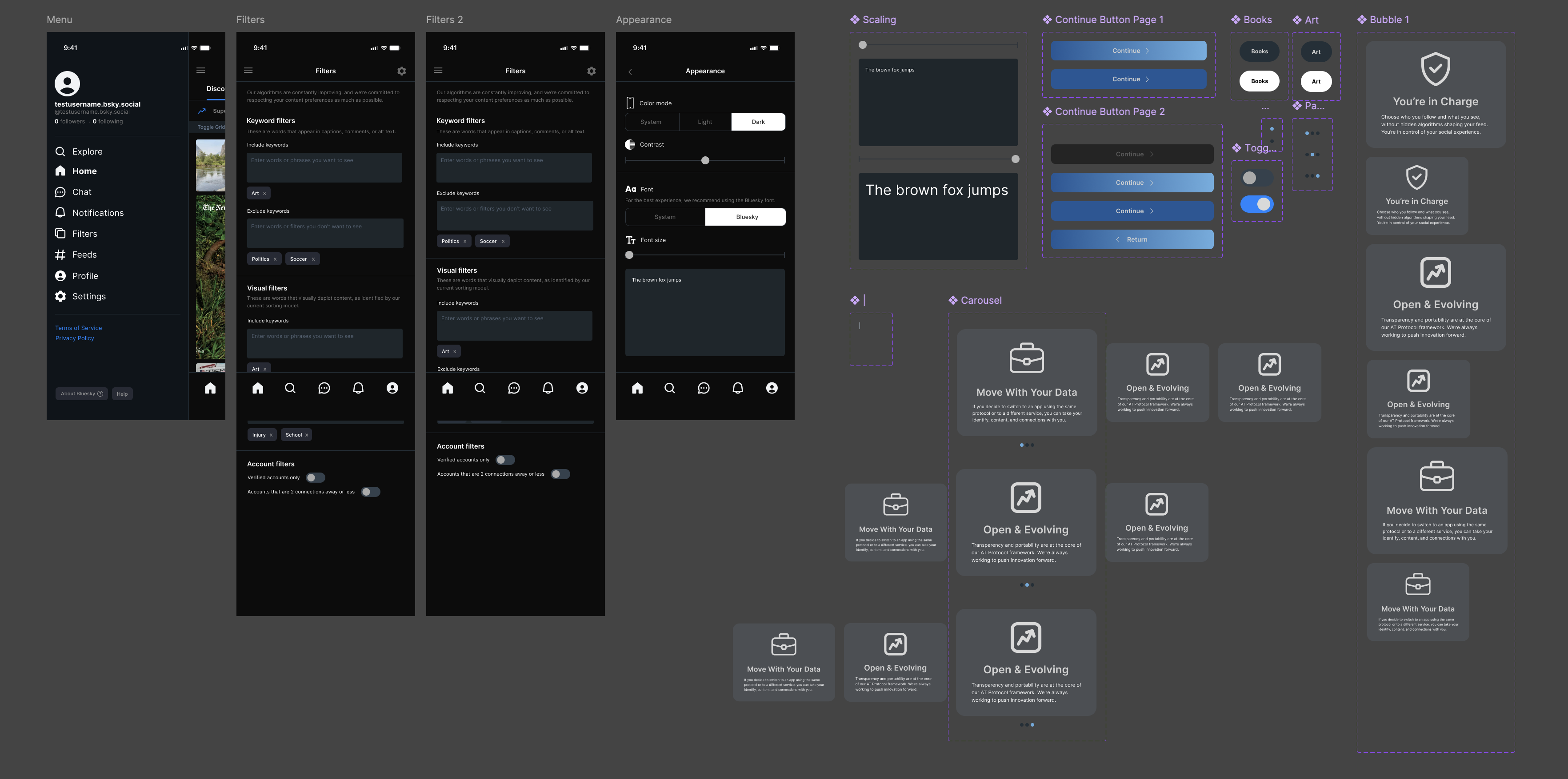
Note: some secondary screens and components not included for brevity.
Reflection and Takeaways
1. Designing to improve, not to fatigue
During my competitive audit, I encountered a wide array of accessibility features offered by competing platforms. While in an ideal world, every feature could be included seamlessly and in a timely manner, I recognized the risk of overwhelming users with complex settings. User research played a crucial role in helping me prioritize, ultimately guiding me to focus on a select few essential features for Bluesky.
2. Accessibility and the status quo
Huge platforms like Reddit and Twitter/X don’t offer alt text editing, so why should I?. This idea first came to mind as I was brainstorming accessibility solutions. How can these platforms overlook such a simple feature that would vastly expand media access for many? The reality is, today’s accessibility standards are far behind where they should be. Despite hundreds—if not thousands—of users voicing their desire for this feature, major platforms seem to believe they’ve already met an acceptable threshold. In UX, one thing has always proven true: the users always have the answers.
Huge shoutout to Sarah Mei for inspiring this case study layout!